
By the end of this tutorial, you will be able to:
Create traditional horizontal and vertical navigation bars
Create icon navigation bars
Create animated navigation buttons.
This lecture is a basic introduction to creating navigation bars and menus. We will utilize HTML and CSS that we have been covering throughout the semester. We will be using the hover state to trigger hidden menus and to animate navigation buttons. When we cover basic JavaScript in a few weeks, you will be able to create responsive menus that display or hide by clicking, so hold tight because there is more to come!
Unordered lists display items with bullets next to them. We have been using this type of list for items that need to be in a list, but have no specific order.
Example of an Unordered List
Unordered lists begin with a <ul> tag and end with a </ul> tag. Bulleted items within the list begin with an <li> tag and end with a </li> tag.
Code example
<ul>
<li>Add 1 1/2 cups flour</li>
<li>Add 1/4 cup cocoa</li>
<li>Add 1/2 cup sugar</li>
</ul>
You can change the default bullet style using the list-style-type rule
Syntax: list-style-type:value
Where value can be: disc, circle, square OR none
A navigation menu is simply an unordered list of links that are styled into a horizontal or vertical navigation bar.
Example of an unordered list containing links:
<ul>
<li><a href="default.html">Home</a></li>
<li><a href="news.html">News</a></li>
<li><a
href="contact.html">Contact</a></li>
<li><a
href="about.html">About</a></li>
</ul>
To convert the list into a menu, you need to:
1) remove bullets, margins and padding from the list
2) determine if you are creating a horizontal or vertical list
3) convert the li a selectors display to block for a vertical list and inline for a horizontal list
4) apply styling for the width, color, borders etc.
5) apply styling for li a:hover
Example of a vertical bar:
Steps to create the navigation bar include:
a) Add the HTML unordered list containing links to the pages you want to navigate to
Example:
<nav>
<ul>
<li><a href="#">Home</a></li>
<li><a href="https://www.facebook.com/lisa.balbach">Facebook</a></li>
<li><a href="https://lisabalbach.wordpress.com/">WordPress</a></li>
<li><a href="https://www.pinterest.com/lisabalbach/">Pinterest</a></li>
</ul>
</nav>
b) Add css to style the ul, li a, and li a:hover selectors
Example of css used for the list above:
<style>
ul {
list-style-type: none;
margin: 0;
padding: 0;
background-color: green;
box-shadow:2px 2px black;
width:200px;
}
li a {
display: block;
padding: 8px 16px;
text-decoration: none;
color:white;
border-bottom:2px solid black;
}
li
a:hover {
background-color: #555;
color: white;
}
</style>
Let's take a closer look at the CSS styling for the menu:
1) Styling for the ul selector
ul {
list-style-type: none;
margin: 0;
padding: 0;
background-color: green;
box-shadow:2px 2px black;
width:200px;
}
Here's what the styling is doing:
2) Styling for the li a selectors
li a {
display: block;
padding:
8px 16px;
text-decoration: none;
color:white;
border-bottom:2px solid black;
text-align:center;
}
Here's what the styling is doing:
3) Styling for the li a:hover selector
li a:hover {
background-color: #555;
color: white;
}
Here's what the styling is doing: background-color: #555; and color: white; change the color of the menu button when you point at it
Menus are typically placed within the <nav></nav> tags. Using the flexbox display:inline-flex style rule will display other elements next to the navigation element. The element you apply the style rule to depends upon how you want your page laid out
Layout #1:
CSS Example:
body{
display:inline-flex;
}
section{
width:50%;
padding:1%;
outline:1px solid black;
}
To see an example of a vertical menu with one section displayed next to it, view: vertical-menu-example.html Because both the <nav> and <section> elements are within the <body> they are child elements and will display side by side. To see the code used, right click the page and select View Source Code
If you don't want all elements within the page to be included in the flexbox display, you can add the display element to a different selector or use the <div> tag
Layout #2
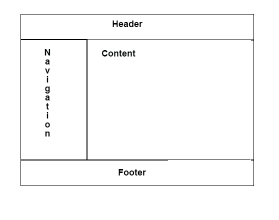
CSS Example:
div{
display:inline-flex;
}
Only elements within <div> will be displayed side by side. In the html shown below, only the <nav> and <section> elements will be displayed side-by side because they are within the <div> element. The contents of <header> and <footer> are not included in the flexbox display
<body>
<header><h1>Vertical menu example
#2</h1></header>
<div>
<nav>
<ul>
<li><a href="#">Home</a></li>
<li><a href="https://www.facebook.com/lisa.balbach">Facebook</a></li>
<li><a href="https://lisabalbach.wordpress.com/">WordPress</a></li>
<li><a href="https://www.pinterest.com/lisabalbach/">Pinterest</a></li>
</ul>
</nav>
<section>
<p>Select the links and visit some of my social media sites.
The WordPress site highlights some digital artwork that is for sale at local
galleries.
The pinterest site has thousands of pins on a wide variety of topics from
HTML and web design to cooking</p>
</section>
</div>
<footer><p>© Lisa Balbach, NMC</p></footer>
</body>
To see the example live with all css, view: vertical-menu-example-modified.html
You can create submenus within your navigational menu by inserting a nested list AND by specifying different formatting for this list so the items are slightly smaller and indented.
Example:
Example of a vertical bar with a submenu:
As you may have noticed, styling nested navigation menus requires a lot of css and the nested css selectors can get a little confusing.
There is another way to specify css for navigation lists. This method involves using IDs in place of the HTML elements.
Using IDs will reduce the amount of nested CSS you have to code. Here's the same example that we were looking at before, but now we are using IDs instead of selectors
Example:
Example of a vertical bar with a submenu (css is styled with IDs):
Here's the css used to create the menu:
#menu ul {
background-color: green;
width:200px;
list-style-type: none;
margin: 0;
padding: 0;
}
#menu li a{
display: block;
padding: 16px;
text-decoration: none;
color:white;
border-bottom:2px solid black;
border-right:2px solid black;
}
#menu a:link, #menu a:visited {
font-size:10pt;
font-weight:bold;
display:block;
padding:3px 0px 3px 3px;
background-color:green;
color:white;
border-bottom:2px solid black;
border-right:2px solid
black;
}
#menu a:hover, #menu a:active{
font-size:10pt;
font-weight:bold;
display:block;
padding:3px 0px 3px 3px;
background-color:white;
color:green;
border-bottom:2px solid black;
border-right:2px solid
black;
}
#submenu{
margin-left:5px;
margin-top:-2px;
width :110px;
list-style-type:none;
text-indent:20px;
}
#submenu
a{
text-decoration:none;
font-size:8pt;
margin-bottom:2px;
}
The ID method makes the CSS a little cleaner, it is independent of HTML elements, so it is more flexible.
The HTML method is very clear regarding which elements are being formatted and it is pretty straightforward.
Both are being used in industry. We will use both so you can see which one you prefer.
Horizontal navigation bars are similar to vertical bars, the main difference is you want
the "buttons" to display side-by-side which means the display must be set to
inline or inline-table instead of block. You can also use the float setting
to make menu buttons display display side-by-side.
Example of a horizontal navigation list:
Here's the html used for the menu:
<nav>
<ul>
<li><a
href="http://lisabalbach.wordpress.com" >WordPress </a></li>
<li><a
href="https://www.flickr.com/search/?q=lisa+balbach">Flickr</a></li>
<li><a
href="http://www.pinterest.com/lisabalbach/">Pinterest </a></li>
</ul>
</nav>
Here's the CSS:
nav a {
text-decoration:none;
}
nav ul{
list-style:none;
}
nav ul li{
border-bottom:2px
solid #ffffff;
border-right:2px solid #ffffff;
display:inline;
}
nav ul li a:link, nav
ul li a:visited {
font-size:10pt;
margin:inherit;
font-weight:bold;
padding:10px;
background-color:green;
color:white;
}
nav ul li
a:hover, nav ul li a:active{
font-size:10pt;
font-weight:bold;
padding:10px;
background-color:white;
color:green;
}
The same thing that you see above with the nested HTML elements can be accomplished using ID's and single elements (see below):
CSS Example:
<style>
#horizontal-menu {
margin:0px;
padding:0px;
}
#horizontal-menu li{
list-style-type:none;
display:inline-table;
}
#horizontal-menu a:link, #horizontal-menu a:visited {
font-size:10pt;
margin:inherit;
font-weight:bold;
padding:10px;
background-color:green;
color:white;
text-decoration:none;
border-bottom:2px solid black;
border-right:2px solid black;
}
#horizontal-menu a:hover, #horizontal-menu
a:active{
background-color:white;
color:green;
}
</style>
How it looks in HTML:
<nav
id="horizontal-menu">
<ul>
<li><a href="http://lisabalbach.wordpress.com"
>WordPress </a></li>
<li><a
href="https://www.flickr.com/search/?q=lisa+balbach">Flickr</a></li>
<li><a
href="http://www.pinterest.com/lisabalbach/">Pinterest </a></li>
</ul>
</nav>
Here's how it looks live:
Creating a submenu that displays and hides in a horizontal menu is a little tricky. It involves hiding the display of the nested list until the user points at the line above the nested list. when the user points at the line above the list, the list displays. When the user points away from the line, the list is hidden
It is helpful to view the first unordered list as the main menu and the nested list as a submenu when you are trying to visualize what the code is doing :)
1) Triggering the display of the submenu (nested list) and setting up the HTML for the submenu
The CSS below is critical to displaying the submenu (nested list). The CSS code is looking at the line, <li> tag, in the main menu to see if it contains a second unordered list (<ul>) tag. If the <li> tag includes a <ul> tag, then it displays the list
nav ul li:hover>ul {
display:block;
}
When you set up your HTML, you need to put the entire nested list inside the <li> and </li> tags as shown in the example below:
<ul> /* main menu */
<li ><a href="#">Home</a></li>
<li><a href="https://www.facebook.com/lisa.balbach">Facebook</a></li>
<li><a href="https://www.pinterest.com/lisabalbach/">Pinterest</a></li>
<li><a href="#">Photography Sites</a>
<ul> /* submenu */
<li><a href="https://lisabalbach.wordpress.com/">WordPress</a></li>
<li><a
href="https://www.flickr.com/search/?q=lisa+balbach">Flickr</a></li>
<li><a href="https://www.instagram.com/lisabalbach/">Instagram</a></li>
<li><a
href="https://www.icloud.com/sharedalbum/#ABGWZuqDGvA6y3">iCloud</a></li>
</ul>
</li>
</ul>
2) Hiding the nested list and formatting the container
The initial state of the list is for it to be hidden unless the user is pointing at the menu line that contains the submenu (ie nested list). The CSS below indicates the submenu is hidden and it specifies formatting for the submenu when it does display. The menus position will be absolute in relation to the main menu and it will display directly below the main menu item it is related to (that is what position:absolute; and top:100% are doing). The background of the submenu will be white and it will have a black border around it.
nav ul ul {
display: none;
padding: 0px;
position: absolute;
top: 100%;
background:white;
border:2px solid black;
}
3) Setting defaults for each line within the submenu
The display of the submenu should be block so it is vertical rather than horizontal. The top and bottom borders help define each menu command ( or link) The position of the items is set to relative indicating the lines are positioned relative to one another and to the container which is the submenu (or unordered list). Including the margin setting in the css puts a little spacing around the menu commands
nav ul ul li {
display:block;
border-top: 1px solid #757575;
border-bottom: 1px solid
#757575;
position: relative;
text-align:left;
margin:30px;
}
4) Styling the links within the submenu by setting link and hover states
nav ul ul li a {
padding: 15px;
color: #757575;
background: radial-gradient(white,green);
}
nav ul ul li a:hover {
background: black;
color:lightgreen;
}
Here's how it looks live:
Here's all the CSS used for the menu shown above.
nav {
margin-left:40px;
margin-top:0px;
}
nav ul {
background:
linear-gradient(0deg, white, green, white);
box-shadow:
6px 6px 6px rgba(0,0,0,0.15);
padding: 0 20px;
border-radius: 10px;
list-style: none;
position: relative;
display: inline-table;
color:white;
font-weight:900;
}
nav ul li {
display:inline-table;
}
nav ul li:hover a {
color:black;
text-decoration: none;
}
nav
ul li a {
display: block;
padding:
25px;
color:white;
text-decoration:
none;
}
nav ul li:hover {
background: radial-gradient(white,green);
}
nav ul li:hover>ul {
display:block;
}
nav ul ul {
display: none;
padding: 0px;
position: absolute;
top: 100%;
background:white;
border:2px solid black;
}
nav ul ul li {
display:block;
border-top: 1px solid #757575;
border-bottom: 1px solid #757575;
position: relative;
text-align:left;
margin:30px;
}
nav ul ul li a {
padding: 15px;
color: #757575;
background: radial-gradient(white,green);
}
nav ul ul li a:hover {
background: black;
color:lightgreen;
}
You can use CSS 3 to animate menus so they slide onto the screen. You can also use icons from an icon library to create an icon navigation bar or you can create your own icons using HTML code for various symbols.
Icons or glyphicons are small vector graphics you can add to your pages. They can be used in buttons, text, toolbars, navigation, forms etc.
To create an icon menu bar, you need to import a stylesheet library that contains the icons. Font Awesome 4.0 and Google Fonts both have icons that you can use for free. Today we are going to look at Font Awesome icons.
Font awesome has free icons and they have icons you must pay for called "pro" icons. In order to use the icons, you have to link to their library and you have to add code for the icon.
You can find icons, library information, and code at :
W3Schools Font Awesome 4 https://www.w3schools.com/icons/fontawesome_icons_webapp.asp (The site includes examples of the code you need to use in your pages, along with the library link).
W3Schools Font Awesome 5 https://www.w3schools.com/icons/fontawesome5_intro.asp
Font Awesome website https://fontawesome.com/icons?d=gallery
NOTE: To use FontAwesome 5, you must get a free account where you will be assigned a kit code similar to the example below:

To use font awesome 5 icons, just copy the kit code script and paste it between your <head> and </head> tags.
The examples below use Font Awesome 4 and Font Awesome 5 icons.
If you have icons from multiple libraries (like Font Awesome 4 and 5), your kit code can be used to pull in all the libraries you need. The script tag below contains my kit code (you will need to get your own if you want to use font awesome 5).
<script src="https://kit.fontawesome.com/674125de1a.js" crossorigin="anonymous"> </script>
The following code was used to generate the icons. The first 3 icons are from font awesome 4. The last icon is from font awesome 5. The kit code script tag brought in all necessary libraries automatically.
<p><i class="fa fa-heartbeat" style="font-size:48px;color:orangered"></i></p>
<p> <button style="font-size:24px">Photo Opp <i class="fa fa-camera-retro"></i></button></p>
<p><i class="fa fa-balance-scale" style='font-size:48px;color:rebeccapurple'></i></p>
<p><i class="fas fa-running" style="font-size:48px;color:orangered"></i></p>
You will notice that the icons are created using an icon <i> tag with the icon name as the class. You can style the icons the same way you would style text (you can change the font-size, color etc using inline styles)
Font Awesome 4 icon classes ALL begin with fa (those are the only 2 letters at the beginning of the class name). Font Awesome 5 icons begin with 3 letters, "fa" and then a third letter, like "fas", "far", "fab", etc.
If you are ONLY using Font Awesome 4, then you can use the following link between the <head> and </head> tags to pull in the icon library.
<link rel="stylesheet" href="https://cdnjs.cloudflare.com/ajax/libs/font-awesome/4.7.0/css/font-awesome.min.css">.
To create a menu bar, you need to add the opening icon tag and the closing icon tag between the anchor tags.
Example using icons from Font Awesome 4.0:
<div class="icon-bar">
<a class="active" href="http://lisabalbach.com/"><i
class="fa fa-home"></i></a>
<a
href="https://www.pinterest.com/lisabalbach/"><i
class="fa fa-pinterest"></i></a>
<a
href="https://www.linkedin.com/in/lisa-balbach-30a57892/?trk=hp-identity-name"><i
class="fa fa-linkedin-square"></i></a>
<a
href="https://www.youtube.com/channel/UCqL3eLOTWqld5hx4uGxepqA/featured?view_as=subscriber"><i
class="fa fa-youtube"></i></a>
<a
href="https://www.instagram.com/lisabalbach/"><i
class="fa fa-instagram"></i></a>
</div>
Steps to create an icon bar include:
1) Add the Font Awesome library links for 4.0 between the <head> and the </head> tags
<link rel="stylesheet" href="https://cdnjs.cloudflare.com/ajax/libs/font-awesome/4.7.0/css/font-awesome.min.css">
2) Add the icon tags to your html. The tags should go between the <a> and </a> tags -so they become your link text.
3) Create CSS for the icon bar and the icons. Icon bars can be vertical or horizontal.
a) CSS for Creating a Vertical bar
.icon-bar {
width: 90px; /* Set a specific width */
background-color: #555; /* Create a background color */
}
.icon-bar a {
display: block; /* Make the links appear below each other instead of
side-by-side */
text-align: center; /* Center-align text
*/
padding: 16px; /* Add some padding */
transition: all 0.3s ease; /* Add transition for hover effects */
color: white; /* Add a color for the icons*/
font-size: 36px; /*
Increased font-size for the icons*/
}
.icon-bar a:hover {
background-color: #000; /* Add a hover color */
}
Here's how the bar
looks live:
b) CSS for Creating a Horizontal icon bar
.icon-bar {
width: 100%; /* Full-width */
background-color: #555; /* Background color */
overflow: auto; /* Overflow due to float */
}
.icon-bar a {
float: left; /* Float links side by side
*/
text-align: center; /* Center-align text */
width: 20%; /* Equal width (5 icons with 20% width each = 100%) */
padding: 12px 0; /* Some top and bottom padding */
transition: all 0.3s ease; /* Add transition for hover effects */
color: white; /* Icon color */
font-size: 36px; /*
Increased font size to make icons bigger */
}
.icon-bar a:hover {
background-color: #000; /* Add a
hover color */
}
Here's how it looks live:
HTML includes code that can be used to generate a variety of icons. The icons can be used in your text OR you can use them in an icon bar or menu
Codes commonly used in text include:
copyright symbol ©
trademark symbol ™
HTML entities can be typed using entity names, numbers or hexidecimal values. Not all entities have names, but if the entity does have a name, that is probably the easiest way to enter it.
Code Example: © creates the coyright symbol ©. © also creates the copyright symbol ©.
The table below outlines popular symbols and the HTML code you need to use:
| HTML Code for entity name | HTML code for entity number |
Symbol Created |
|---|---|---|
| > | > | > |
| < | < | < |
| © | © | © |
| ™ | ™ | ™ |
| ® | ¤ | ® |
Other HTML entities are entered using the entity number or the entity hexidecimal value
Code Example: The HTML entity number, ☀ creates a black sun symbol ☀. The hexidecimal value ☀ also creates the blacksun symbol ☀.
The table below shows the entity number and hexidecimal value for a variety of icons that could be used in an icon bar, lists, text etc. The primary advantage of using the HTML entity icons is that you don't need to import a special library. The disadvantage is the icon you want may not be available as an HTML entity
| HTML code for entity number | HTML code for hexidecimal value |
HTML code for entity name |
Symbol Created |
|---|---|---|---|
| ☀ | ☀ | Black sun with rays: ☀ | |
| ☼ | ☼ | White sun with rays: ☼ | |
| ☁ | ☁ | Cloud: ☁ | |
| ♠ | ♠ | ♠ | Black spade suit: ♠ |
| ♣ | ♣ | ♣ | Black clubs suit: ♣ |
| ♥ | ♥ | ♥ | Black heart suit: ♥ |
| ♦ | ♦ | ♦ | Black diamond suit: ♦ |
| ☯ | ☯ | Yin & Yang symbol: ☯ | |
| ☮ | ☮ | Peace symbol: ☮ | |
| ☠ | ☠ | Skull & Crossbones: ☠ | |
| ☔ | ☕ | Hot Beverage: ☕ |
For more HTML entites, see: https://www.w3schools.com/charsets/ref_utf_symbols.asp and https://www.w3schools.com/charsets/ref_utf_dingbats.asp
In the example below, HTML entities and text are used in place of the font-awesome icons
Here's the code used to generate the icon bar (the CSS is the same as the CSS used for the font-awesome icon bar )
<div class="hicon-bar" >
<a class="active"
href="http://lisabalbach.com/">🏠Home</a>
<a
href="https://www.pinterest.com/lisabalbach/"> 📌Pinterest</a>
<a
href="https://www.linkedin.com/in/lisa-balbach-30a57892/?trk=hp-identity-name">🔗LinkedIn</a>
<a
href="https://www.youtube.com/channel/UCqL3eLOTWqld5hx4uGxepqA/featured?view_as=subscriber">
📺YouTube</a>
<a
href="https://www.instagram.com/lisabalbach/">📷 Instagram</a>
</div>
If you are interested in using HTMl entities, but don't know if an entity
exists, you can do a search on the entity. Example: "HTML entity
code for person" or "HTML entity code for television"
Animated buttons will expand or move when you hover over them. To create the effect, we will use the CSS 3 transition property.
To create hoverable side navigation buttons, you need to do the following:
1) Add your HTML links to the page. Place the links inside some type of container like a <div> tag or the <nav> tag. Some web pages have multiple navigation areas, so the buttons are placed in a div tag so the styling doesn't impact other areas of the page.
<div id="mySidenav" class="sidenav">
<a href="#"
id="about">About</a>
<a href="#" id="blog">Blog</a>
<a href="#" id="projects">Projects</a>
<a href="#"
id="contact">Contact</a>
</div>
2) Add the CSS (the CSS below includes comments to help you follow what it is doing)
/* Style the links inside the sidenav */
#mySidenav a {
position: absolute; /* Position them relative to the browser window */
left: -80px; /* Position them outside of the screen */
transition: 0.3s; /* Add transition on hover */
padding:
15px; /* 15px padding */
width: 100px; /* Set a specific
width */
text-decoration: none; /* Remove underline */
font-size: 20px; /* Increase font size */
color: white; /*
White text color */
border-radius: 0 5px 5px 0; /* Rounded
corners on the top right and bottom right side */
}
#mySidenav a:hover
{
left: 0; /* On mouse-over, make the elements appear as
they should */
}
/* The about link: 20px from the top with a green
background */
#about {
top: 20px;
background-color: goldenrod;
}
#blog {
top: 80px;
background-color: green;
}
#projects {
top: 140px;
background-color: slateblue;
}
#contact {
top: 200px;
background-color: black;
}
Here's the example live: