By the end of this tutorial, you will be able to:
Create traditional horizontal and vertical navigation bars
Create icon navigation bars
Create animated navigation buttons.
This lecture is a basic introduction to creating navigation bars and menus. We will utilize HTML and CSS that we have been covering throughout the semester. We will be using the hover state to trigger hidden menus and to animate navigation buttons. When we cover basic JavaScript in a few weeks, you will be able to create responsive menus that display or hide by clicking, so hold tight because there is more to come!
1. Open your CIT180 folder and create a new folder named Lesson10. That is the only folder you will need for this lesson :)
Files you need to download are located within each task instead of in task #1 because you will be downloading a zipped folder containing a file structure, css and media folders.
Task: Create a vertical menu for a small website that will display on all pages using HTML and CSS
To see a video demonstration, watch: https://youtu.be/5R82JdfwYwA
NOTE: The video assumes you have downloaded the zipped file and you are ready to extract it (so it begins at step #2)
1. Dowload the following zipped file: Acme-Vertical.zip
2. Unzip the file into your CIT180/Lesson10 folder
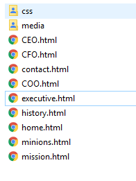
3. After you unzip the file, you should see an Acme-Vertical folder. Inside that folder, you should see nine web pages and 2 folders as illustrated in the example below:
4. The only file you will have to change is the acme-vertical.css file that is located in the css folder. All the web pages include that external css file for formatting.
5. Open acme-vertical.css for editing AND open home.html in a web browser so you can observe changes as we make them.
6. The first adjustment we are going to make is to add a flexbox to the body selector.
Add display:inline-flex; to the body css as shown below:
body {
font:12pt Verdana, Arila, Georgia, sans-serif;
display:inline-flex;
overflow:auto;
background:url('../media/green-swirly.png');
background-position:bottom left;
background-repeat:no-repeat;
}
7. Save your changes and reload the home.html page displayed in the web browser. You should note that css for the nav and section elements has been created already. The css is used to control the widths. We also added css to adjust the top margin and the right margin for the nav selector (the right margin affects how close the section element is to the nav element).
8. To remove the underlining from the anchor elements (links) in the nav group, add the following css:
nav a {
text-decoration:none;
}
9. To remove underlining from anchor elements (links) in the section group and to modify the link color, add the following css:
section a:link {
text-decoration:none;
font-weight:bold;
color:green;
}
10. Save your changes and reload the home page in your browser. You should ntoice the underlining is gone from all the links on the page.
11. To format the links in the navigation area to look and act like menu buttons, you need to format several elements: ul, ul li, ul li a etc Because we have links on the page that are not part of the navigation, we need to prefix the formatting with nav That tells the browser to only format unordered list elements in the nav section and not other areas of the page.
For the unordered list, enter the following css to remove bullets, adjust margins and adjust padding:
nav ul{
list-style-type:none;
margin:12px 0px 0px 0px;
padding:0px;
}
For the lines in the unordered list, enter the following border (that will place a line below each "button"):
nav ul li{
border-bottom:2px solid black;
}
Save your changes and view the home page offline.
12. To apply color to our buttons and the button text, we need to style the links. We can do this by applying css to the 4 link states. Because we only want to affect links that are in the navigation area, we need to prefix them with nav ul li
/* syling a:link and a:visited */
nav ul li a:link, nav ul li a:visited {
font-weight:bold;
display:block;
padding:3px 0px 3px 3px;
background-color:green;
color:white;
}
/* styling a:hover and a:active */
nav ul li a:hover, nav ul li a:active{
font-weight:bold;
display:block;
padding:3px 0px 3px 3px;
background-color:lightgreen;
color:darkgreen;
}
13. Save your changes and view the page offline. You will notice that clicking on Excecutive Teams displays a submenu, but the submenu doesn't look all that great (we need to apply some styling to that too).
Add the css shown below to style the submenu:
nav ul ul{
margin:0px;
text-indent:20px;
}
nav ul ul li a:link, nav ul ul li a:visited {
font-size:10pt;
font-weight:bold;
display:block;
padding:3px 0px 3px 3px;
background-color:green;
color:white;
}
nav ul ul li
a:hover, nav ul ul li a:active{
font-size:10pt;
font-weight:bold;
display:block;
padding:3px 0px 3px 3px;
background-color:white;
color:green;
}
14. Save your changes and test all the links. You will notice that when you click About Us, Mission, History and Contact Us, the submenu doesn't display. It only displays when you select Executive Teams. The reason you don't see the submenu is because the html doesn't include it in those pages (the submenu is only included in Executive Teams, CEO, CFO, COO and Other Minions.)
There is a way to hide or display submenus and you will be learning that in the Horizontal menu section.
15. If everything looks good, save all your changes and close the files.
Task: Copy the Acme Vertical folder and modify the CSS and HTML to use IDs instead of nesting elements
To see a video demonstration, watch: https://youtu.be/-Esgdcxzq0U
1. Go into the CIT180/Lesson10 folder, right click the Acme-Vertical folder, select copy, right click in an empty area of the open folder and select paste.
2. Right click the new folder and select Rename. Enter Acme-Vertical-ID
3. Go into the Acme-Vertical-ID folder, open the CSS folder and edit acme-vertical.css
4. Make the modifications shown below to convert the css to use IDs
body {
font:12pt Verdana, Arila, Georgia, sans-serif;
display:inline-flex;
overflow:auto;
background:url('../media/green-swirly.png');
background-position:bottom left;
background-repeat:no-repeat;
}
nav {
width:200px;
margin-top:12px;
margin-right:18px;
}
section{
width:550px;
height:400px;
}
nav a {
text-decoration:none;
}
section a:link {
text-decoration:none;
font-weight:bold;
color:green;
}
#menu ul{
margin: 0px;
padding:0px;
}
#menu li{
list-style-type:none;
border-bottom:2px solid black;
}
#menu a:link, #menu a:visited {
font-weight:bold;
display:block;
padding:3px 0px 3px 3px;
background-color:green;
color:white;
}
#menu a:hover, #menu
a:active{
font-weight:bold;
display:block;
padding:3px 0px 3px 3px;
background-color:lightgreen;
color:darkgreen;
}
#submenu li{
text-indent:20px;
}
#submenu a:link, #submenu a:visited {
font-size:10pt;
font-weight:bold;
display:block;
padding:3px 0px 3px 3px;
background-color:green;
color:white;
}
#submenu a:hover,
#submenu a:active{
font-size:10pt;
font-weight:bold;
display:block;
padding:3px 0px 3px 3px;
background-color:white;
color:green;
}
5. Open executive.html, CEO.html, CFO.html, COO.html and minions.html Modify the nav section by adding the IDs as shown below:
<nav>
<ul id="menu">
<li><a href="home.html">About Us</a></li>
<li><a href="mission.html">Mission</a></li>
<li><a href="history.html">History</a></li>
<li><a href="executive.html">Executive Teams</a></li>
<ul id="submenu">
<li><a href="CEO.html">» CEO</a></li>
<li><a href="CFO.html">» CFO</a></li>
<li><a href="COO.html">» COO</a></li>
<li><a href="minions.html">» Other Minions</a></li>
</ul>
<li><a href="contact.html">Contact Us</a></li>
</ul>
</nav>
6. Open mission.html, home.html, history.html, and contact.html. Modify the nav section by adding the ID for menu as shown below:
<nav>
<ul id="menu">
<li><a href="home.html">About Us</a></li>
<li><a href="mission.html">Mission</a></li>
<li><a href="history.html">History</a></li>
<li><a href="executive.html">Executive Teams</a></li>
<li><a href="contact.html">Contact Us</a></li>
</ul>
</nav>
7. Save all your changes and test the pages offline in the browser.
Task: Create a horizontal menu with a hidden submenu for a business website
To see a video demonstration, watch: https://youtu.be/6q7L4ebQOw4
1. Dowload the following zipped file: Acme-Horizontal.zip
2. Unzip the file into your CIT180/Lesson10 folder
3. After you unzip the file, you should see an Acme-Horizontal folder. Inside that folder, you should see nine web pages and 2 folders as illustrated in the example below:
4. The only file you will have to change is the acme-horizontal.css file that is located in the css folder. All the web pages include that external css file for formatting.
5. Open acme-horizontal.css for editing. The following pdf file includes all CSS for the page. acme-horizonta-css.pdf The instructions below add the css incrementally and explain what the css is doing.
6. Add CSS for navigation bar positioning (the positioning below will put the bar at the top with a little space on the left-hand side)
nav {
margin-left:40px;
margin-top:0px;
}
7. Add CSS for the navigation bar formatting (the css will effect the entire navigation bar). The background wll be a gradient with white on the top/bottom and green in the middle. There will be a box shadow that has some transparency. The left and right sides of the bar will have some padding. The bar will have rounded corners due to border-radius at 10 pixels, the position is set to relative so it is relative to other items on the page, the display is an inline-table which means it will be horizontal. The font color is white and the font is boldfaced.
nav ul {
background: linear-gradient(0deg, white,
green, white);
box-shadow: 6px 6px 6px rgba(0,0,0,0.15);
padding: 0 20px;
border-radius: 10px;
list-style: none;
position: relative;
display: inline-table;
color:white;
font-weight:900;
}
8. The main menu commands are actually <li> tags in the unordered list. To control the appearance of the commands, you need to style the li tags and the anchor tags contained within them.
a) Add code that indicates each line is part of an inline-table
nav ul li {
display:inline-table;
}
b) Add code to control how the command looks when you point (this requires modifying the hover state of the <li> selector). The code below will change the background to a radial gradient when you point at a menu command.
nav ul li:hover {
background:
radial-gradient(white,green);
}
c) Add code that indicates what the anchors in each line should look like:
nav ul li a {
display: block;
padding: 25px 40px;
color:white;
text-decoration: none;
}
d) Add code to control how the submenu links display and how they look when you point at them (this involves styling nav ul li a for the initial look and nav ul li:hover a for the look when you are pointing at a submenu item).
When the submenu initially displays, display:block makes the background color fill the area the line occupies AND it makes the entire line clickable instead of just the link text. Padding is set for the top/bottom and left/right so the text isn't against the edge. The font color will be white and it won't be underlined
nav ul li a {
display: block;
padding: 25px 40px;
color:white;
text-decoration: none;
}
When you point at a submenu item, the color will change to black and the item won't be underlined.
nav ul li:hover a {
color:black;
text-decoration: none;
}
NOTE: The background color remains the same.
9. Add the code shown below which displays the submenu when you point at the main menu item that is connected to the submenu. The flex display with the direction set to column will make the submenu display vertically
nav ul li:hover > ul {
display:flex;
flex-direction:column;
}
10. Add the code shown below which sets the initial state of the submenu. When the page loads, the submenu will be hidden (that is what display:none; does. When the submenu does display, there will be a radial gradient for color, the edges will be squared off instead of rounded because border-radius is set to 0 and there won't be extra spaces between the content and the edge of the container because padding is set to zero. The position setting of absolute ensures the submenu will display below the menu item it is connected to. The z-index setting ensures that if the resolution increases or the screen size decreases, the submenu will display on top of the main menu
nav ul ul {
display: none;
background: radial-gradient(white,green);
border-radius:
0px;
padding: 0px;
position:
absolute;
z-index:10;
}
11. Add the code shown below - it is used to style each line within the submenu. Display set to block ensures the entire area within a line is clickable. The top and bottom borders help define the command button. Position relative keeps the buttons in proximity to one another
nav ul ul li {
display:block;
border-top: 1px solid #757575;
border-bottom: 1px solid
#757575;
position: relative;
text-align:left;
}
12. Add the code shown below for link styling within the submenu.
nav ul ul li a {
padding: 15px 40px;
color: #757575;
}
nav ul ul li a:hover {
background: black;
color:lightgreen;
}
13. Save your changes and view the page offline. If it isn't displaying correctly, double check your css against the pdf file in step 5.
14. Correct any errors and save all your changes.
Task: Add a horizontal icon navigation menu bar to the bottom of a page
1. Download my-profitable-web-design-business.html to the Lesson10 folder.
2. Open the page for editing
3. Open the page in the web browser to see what it currently looks like.
4. You will be adding a font-awesome horizontal icon navigation menu similar to the one discussed in the lecture. The icon navigation menu wll be added to the footer of the page.
To do that, enter the following HTML between the <footer> and </footer> tags:
<div class="icon-bar">
<a href="http://lisabalbach.com/"><i
class="fa fa-home"></i></a>
<a
href="https://www.pinterest.com/lisabalbach/"><i
class="fa fa-pinterest"></i></a>
<a
href="https://www.linkedin.com/in/lisa-balbach-30a57892/?trk=hp-identity-name"><i
class="fa fa-linkedin-square"></i></a>
<a
href="https://www.youtube.com/channel/UCqL3eLOTWqld5hx4uGxepqA/featured?view_as=subscriber"><i
class="fa fa-youtube"></i></a>
<a
href="https://www.instagram.com/lisabalbach/"><i
class="fa fa-instagram"></i></a>
</div>
NOTE: To create dummy links, you would replace href="http://lisabalbach.com/" with href="#" You can use the real links or the dummy links for this (it is up to you)
5. Add the following external link to the <head> section of your page
<link rel="stylesheet"
href="https://cdnjs.cloudflare.com/ajax/libs/font-awesome/4.7.0/css/font-awesome.min.css">
6. Add the following CSS to style the icon bar and to add space between the footer and existing content (the new CSS should go at the bottom of the style section right above the </style> tag.
footer{
margin-top:200px;
}
.icon-bar {
width:
100%; /* Full-width */
background-color: darkorange;
overflow: auto; /* Overflow due to float */
}
.icon-bar a {
float: left; /* Float links side by side */
text-align:
center; /* Center-align text */
width: 20%; /* Equal width
(5 icons with 20% width each = 100%) */
padding: 12px 0;
/* Some top and bottom padding */
transition: all 0.3s
ease; /* Add transition for hover effects */
color: white;
/* White text color */
font-size: 36px; /* Increased font
size */
}
.icon-bar a:hover {
background-color: #000; /* Add a hover color */
}
7. Test the page offline. If you are using real links, you should
go to the actual pages when you click them. If you are using dummy links,
you will remain on the profitable business page. Correct any errors.
Save your changes and close the page.
Task: Add an animated sidebar menu to a web page
To see a video demonstration, watch:
https://youtu.be/ljB2xuxS-ds
1. Download animation-fun.html into your Lesson10 folder.
2. Open the page in your web editor and open it offline in the web browser. You will see several animated circles at the bottom of the page (the code for the animation is in the internal style sheet).
3. You will be adding hoverable side navigation buttons to the page similar to the ones displayed in the lecture. To do that, add the following HTML code right below the <body> tag
<div id="mySidenav" class="sidenav">
<a href="#"
id="about">About</a>
<a href="#" id="blog">Blog</a>
<a href="#" id="projects">Projects</a>
<a href="#"
id="contact">Contact</a>
</div>
4. Next, add the css to the bottom of the internal style sheet, right above the </style> tag:
/* Style the links inside the sidenav */
#mySidenav a {
position: absolute; /* Position them relative to the browser window rather than
the content*/
left: -80px; /* Position them outside of the
screen */
transition: 0.3s; /* Add transition on hover */
padding: 15px; /* 15px padding */
width: 100px; /* Set a
specific width */
text-decoration: none; /* Remove
underline */
font-size: 20px; /* Increase font size */
color: white; /* White text color */
border-radius: 0 5px
5px 0; /* Rounded corners on the top right and bottom right side */
}
#mySidenav a:hover {
left: 0; /* On mouse-over, make the
elements appear as they should */
}
/* The about link: 20px from the
top with a green background */
#about {
top: 20px;
background-color: rgb(0, 152, 255);
}
#blog {
top: 80px;
background-color: rgb(237, 87, 255);
}
#projects {
top: 140px;
background-color: rgb(235, 47, 0);
}
#contact {
top: 200px;
background-color: rgb(232, 158, 0);
}
5. Save your changes and view the page offline. Correct any errors, save and close the page.
1. FTP everything in the Lesson 10 folder to the main directory on the server. You should have the following items in the folder:
Acme-Vertical folder 6 points
Acme-Vertical-ID folder 4 points
Acme-Horizontal folder 5 points
my-profitable-web-design-business.html 5 points
animation-fun.html 5 points
2. After ftping, you should check the pages "live". If there are errors, you should correct them, then transfer the pages again and check them.
For each of the folders, you will need to enter lisabalbach.com/yourUserName/Acme-Vertical/home.html, lisabalbach.com/yourUserName/Acme-Vertical-ID/home.html, and lisabalbach.com/yourUserName/Acme-Horizontal/home.html to get to the first page at the site so you can ensure that everything works Make sure you replace yourUserName with the username your NMC username (that is how your accounts were set up on the system)