
By the end of this tutorial, you will be able to:
explain what responsive web design is
create responsive web pages
use relative values for page widths, images, containers etc.
explain what Grid-View is
use Grid-View to create responsive pages
explain what a ViewPort is and why the ViewPort <meta> tag is important
use the ViewPort <meta> tag in all web pages.
create print and screen css
adjust pages for search engine optimization (SEO)
We have been incorporating responsive web design features into our pages since the beginning of the semester. This lesson brings it all together and includes additional information on creating responsive pages. From this point forward, we will be including responsive features in all our pages to ensure they can be viewed properly on any device.
Responsive web design ensures that the page can be viewed on desktops, tablets and phones AND that the page looks good on all devices.
Responsive web design uses only HTML and CSS - it does NOT use scripting languages like JavaScript.
The main idea is the page should adapt to fit any device, but it should not leave out information or content. It is called responsive because you use CSS and HTML to resize, hide, shrink, enlarge and/or move content so the content looks good
Example of devices and adaptations:
Retrieved from W3C schools, July 2020
When we looked at the box model and used flexbox, we were using a responsive layout. When we created traditional pages and used percentages for the widths of the various containers, we were creating a responsive page because percentages will adapt to the size of the screen.
One key concept in Responsive Web Design is a focus on the user's visible area of the web page. That visible area is called a viewport.
Viewports vary among devices and within device categories. Desktops,tablets and mobile phones have different sized viewports and within mobile phones, there is a wide variety of viewport sizes.
Prior to tablets and mobile phones, web pages were designed for computer monitors. It was common for web pages to have a static design and a fixed size. The widespread use of tablets and mobile phones for accessing the web required changing how pages were designed. The static, fixed design made the pages too big for the smaller, mobile devices. Quite often, the large pages were simply scaled down to fit the smaller screens which made them hard to read and navigate.
HTML 5 introduced a technique that allowed designers to take control of the viewport using the <meta> tag.
The following <meta> tag should be included in all web pages:
Syntax for viewport meta tag:
<meta name="viewport" content="width=device-width, initial-scale=1.0">
Here's what the tag is doing:
The content="width=device-width" attribute sets the width of the page to follow the
screen-width of the device (which will vary depending on the device).
The
initial-scale=1.0 attribute sets the initial zoom level when the page is first loaded
by a browser (NOTE: If you don't use this, the page will display zoomed
out or tiny)
So, the viewport meta tag lets you control the page's dimensions and
scaling.
Here's an example without the <meta> tag - note
how the page is zoomed out
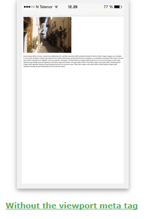
Retrieved from W3C schools, July 2020
Here's an example WITH the <meta> tag:
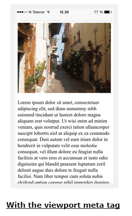
Retrieved from W3C schools, July 2020
When using websites on any device, users expect to scroll vertically, but they do NOT expect to scroll horizontally.
If the user has to zoom out or scroll horizontally to see all the content, it will adversely affect the user's experience at the website AND should be avoided.
So, vertical scrolling is ok, horizontal scrolling is not.
Some things to keep in mind to help prevent horizontal scrolling include:
1. AVOID large fixed width elements. Do
not set the width of containers to a number of pixels that is larger than
400px or 450px because mobile phones would have to scroll horizontally to see the
content. When working with images, you should adjust the content to fit in
the various viewports without scrolling. With the newer HTML 5 background CSS
properties, like background-size set to cover or contain , you can avoid forcing
the user to scroll.
2. Viewport widths vary, so do NOT rely on a
specific width for the page to display correctly. Resolution
varies
widely among devices and so does the physical size of the screen. Make
sure your content doesn't rely on a
particular viewport width to render well.
3. Use CSS media
queries to apply different styling for small and large screens (we will
be learning about media queries later in this lecture). A few years ago,
media queries were extensively used to detect various screen sizes and different
css pages were rendered depending upon the screen size retrieved.
The different CSS pages included completely different images whose size fit the
screen they were being viewed on. Today, that thinking has changed
and the focus is on creating an adaptable, responsive page that can be displayed
on any screen without a lot of modification.
4. Use relative values and lengths instead of absolute - You should use relative width values like percentages for containers and em or vw (viewport width) for fonts. These values would adapt to different screen sizes without any additional modifications to the page. Avoid using large absolute positioning values because large values may cause the element to fall outside the viewport on small devices (this would create a situation where the user would have to scroll to see all the content).
Relative lengths scale better when viewed on different devices.
The table below lists different relative length measurements and how they determine size.
| Unit | Description |
| em | Relative to the font-size of the element (2em means 2 times the size of the current font) |
| ex | Relative to the x-height of the current font (rarely used) |
| ch | Relative to a width of "0" (zero) |
| rem | Relative to font-size of the root element (the element at the top) |
| vw | Relative to 1% of the width of the viewport |
| vh | Relative to 1% of the height of the viewport |
| vmin | Relative to 1% of viewport's* smaller dimension |
| vmax | Relative to 1% of viewport's* larger dimension |
| % | Relative to the same property in the parent element. width:50% is 1/2 the width of the parent element |
For more information on absolute and relative lengths, view: The Lengths of CSS _ CSS-Tricks.pdf
Code Example:
<div style="width:50%; border:2px black solid; padding:10px;">
<h5
><strong>Here's how it looks in the browser:</strong></h5>
<p>This paragraph
uses the default font size.</p>
<p style="font-size:3vw;">This paragraph uses
3vw. To see the text scale, resize the browser window.</p>
<p
style="font-size:2vw;">This paragraph uses 2vw. To see the text scale, resize
the browser window.</p>
<p style="font-size:3em;">Here's what 3em looks
like</p>
<p style="font-size:3ch;">Here's what 3ch looks like</p>
</div>
This paragraph uses the default font size.
This paragraph uses 3vw. To see the text scale, resize the browser window.
This paragraph uses 2vw. To see the text scale, resize the browser window.
Here's what 3em looks like
Here's what 3ch looks like
There are three mobile design layouts you can create using CSS: Flexbox, Grid-View and CSS Grid.
We have been working with the flexbox design layout for the past few weeks and it is considered to be a responsive layout. The flexbox layout doesn't give you as much control as the two grid layouts we will be covering this week.
The responsive grid layouts work by splitting a page into rows and columns to create a responsive grid. The way they create the grid is where the layouts differ.
Grid-View uses classes that you create for columns along with the row command.
CSS Grid uses a template that contains rows, columns or both.
CSS Grid is a bit more complicated that Grid-View. To make this easier to digest, I split this weeks material into two parts. Part 1 covers Grid-View, responsive design concepts and commands. Part 2 only covers CSS Grid and uses the same responsive design concepts as part 1.
Grid view divides a page into 12 columns. The total width of the columns is 100%. The columns shrink or expand as you resize the browser. Columns can be combined (merged) in a variety of configurations, but the total width never exceeds 100%.
When working on pages, you need to visualize the grid (you will not physically see it). You also need to visualize how the content will layout on the grid. If it helps, you can use pencil and paper to draw the 12 columns and then plot how the content will layout on the column framework.
Example:

To see the example live, view: gridview-example.html Restore the web page to the original size (make sure it isn't maximized) then resize the page by dragging the window border and you will see the grid expand and contract to adapt to whatever size you want it to be (large or small)
Buidling a responsive grid view page involves: a) using the box-sizing property set to border-box; and b) using columns with widths set as percentages,
A) Specify box-sizing as border-box for all containers in the page
To create a grid box layout, you need to use the box-sizing css property and the border-box value. This property includes the padding and border in the total width (all you need to do is add in the margins to determine how wide the content is).
To use box-sizing for everything in the page, insert the following css:
* {
box-sizing:border-box;
}
NOTE: The * represents everything in the web page.
B) Determine column widths for the 12 columns or a combination of the 12 columns and set up classes for 12 different column settings
To determine the width of each column in a 12 column layout, you take 100% and divide it by 12 which gives you 8.33% per column. 8.33% represents the width assuming you are going to have 12 columns on the page.
.col-1 {width:8.33%;} /* 12 column layout */
If you want a 6 column layout, you would need 16.66% for each column. If you wanted a 4 column layout, you would need 25% for each column. etc The CSS below covers every possible combination of columns you could have in a grid view display
.col-1 {width: 8.33%;}
.col-2 {width: 16.66%;}
.col-3 {width: 25%;}
.col-4 {width: 33.33%;}
.col-5 {width: 41.66%;}
.col-6 {width: 50%;}
.col-7 {width: 58.33%;}
.col-8 {width: 66.66%;}
.col-9 {width: 75%;}
.col-10 {width: 83.33%;}
.col-11 {width: 91.66%;}
.col-12 {width: 100%;}
In addition to the column CSS, you also need css that will cause the columns to align side-by side. Instead of adding float:left; and padding to every column class, you can use wildcards and add it to all of them at the same time. That is what [class*="col-"] is doing in the css below:
[class*="col-"] {
float: left;
padding: 15px;
}
Here's how the CSS works: The browser looks for classes that begin with col- and applies the CSS in curly braces to the class.
Example of all the CSS you need to add for grid-view:
* {
box-sizing:border-box;
}
[class*="col-"] {
float: left;
padding: 15px;
}
.col-1 {width: 8.33%;}
.col-2 {width: 16.66%;}
.col-3 {width: 25%;}
.col-4 {width: 33.33%;}
.col-5 {width: 41.66%;}
.col-6 {width: 50%;}
.col-7 {width: 58.33%;}
.col-8 {width: 66.66%;}
.col-9 {width: 75%;}
.col-10 {width: 83.33%;}
.col-11 {width: 91.66%;}
.col-12 {width: 100%;}
Applying this to existing pages is relatively easy especially if you have an external CSS file because you only need to modify the external file and the new CSS will be available to all pages that reference the external styles.
To apply the CSS to existing HTML pages, determine which elements make up your columns, how wide you want them to be and then select the appropriate column class. The column class will need to be added to the HTML element using the class attribute (see example below).
In the Acme menu system we worked on last week, we could apply grid view css to create 2 columns. The first column we could set using .col-3 and the second we could set using .col-9 That would make column one 25% of the page and column two 75% of the page.
Example: Simply adding the column classes to your HTML will make the page responsive.
<body>
<nav class="col-3">
<ul>
<li><a href="home.html">About Us</a></li>
<li><a href="mission.html">Mission</a></li>
<li><a href="history.html">History</a></li>
<li><a href="executive.html">Executive Teams</a></li>
<ul>
<li><a href="CEO.html">» CEO</a></li>
<li><a href="CFO.html">» CFO</a></li>
<li><a href="COO.html">» COO</a></li>
<li><a href="minions.html">» Other Minions</a></li>
</ul>
<li><a href="contact.html">Contact Us</a></li>
</ul>
</nav>
<section class="col-9">
<h1>Other Minions Team</h1>
<p>A variety of other teams exist at the headquarters and within each plant
to ensure worker satisfaction and smooth operations. </p>
</section>
</body>
A media query lets you test properties for conditions of the device displaying the page.
It is used to apply a block of code if certain conditions tests true.
Media queries can be used to check many things, such as:
The most common use is to test for different screen widths and apply CSS styling based on the size of the screen.
Media queries consist of a media type, an expression expressed as a media feature that needs to be checked, and a result of true or false.
Syntax:
@media not or only mediaType and (expressions){
css you want modified if the condition is true
}
Where mediaType can be:
all - (default) used for all media type devices
print
- used to apply css for printing
screen - used for computer screens,
tablets, smart-phones etc.
speech - used for screenreaders that "reads"
the page out loud
NOTE: The same mediaTypes can be used in the <link> element for stylesheets. If you have a stylesheet for printing, you can set up the <link> as:
<link rel="stylesheet" media="print" href="css/print.css">
Example #1: @media (max-width:600px) {
.sidebar{
display:none;
}
}
In this example, the width of the device is checked. If it is less than 600 (the max being 600), the sidebar class will not display (the device is not wide enough).
In addition to checking for the max-width, you can check for the min-width, orientation, handheld, device height etc.
I've included more examples below:
Example #2:
@media only screen and (max-width: 480px) {
/* For
mobile phones: */
[class*="col-"] {
width: 100%;
}
}
If the width is 480 or less, all classes that begin with col- will have a width of 100%
Example #3:
@media only screen and (orientation: landscape) {
body
{
background-color: lightblue;
}
}
If the orientation is landscape, the background color changes to lightblue.
Breakpoints typically check the browser window size and apply different css when window size or orientation changes (see examples above).
Breakpoints are added when parts of the design behave differently above or below the breakpoint. Breakpoints are considered to be adaptive design because your application adapts to the size of the screen.
In true responsive design, you wouldn't need to worry about breakpoints because your page will automatically adapt and it will look good on any device and screen size.
In theory, true responsive design focuses on content rather than the size of the device.
In practice, most web designers utilize both responsive and adaptive techniques to make pages display properly.
Mobile first means designing for mobile before any other device. If you are using media queries to detect different device sizes, your default css would be for mobile devices.
If you use Grid-View, your design should look good on phones, tablets, laptops and desktops without adjusting too much. You may want to allow for different column widths on the various devices.
The code below assumes mobile devices will be used and has a breakpoint for tablets and another breakpoint for desktop devices. The tablet and desktop code looks very similar, but it allows us to specify different widths in the HTML by using the tablet or desktop classes
CSS Code example illustrating mobile first
/* For mobile phones: */
[class*="col-"] {
width: 100%;
}
/* For tablets: */
@media only screen and (min-width: 600px) {
.col-m-1 {width: 8.33%;}
.col-m-2 {width: 16.66%;}
.col-m-3 {width: 25%;}
.col-m-4 {width: 33.33%;}
.col-m-5 {width: 41.66%;}
.col-m-6 {width: 50%;}
.col-m-7 {width: 58.33%;}
.col-m-8 {width: 66.66%;}
.col-m-9 {width: 75%;}
.col-m-10 {width: 83.33%;}
.col-m-11 {width: 91.66%;}
.col-m-12 {width:
100%;}
}
/* For desktop: */
@media only screen and (min-width: 768px) {
.col-1
{width: 8.33%;}
.col-2 {width: 16.66%;}
.col-3 {width: 25%;}
.col-4
{width: 33.33%;}
.col-5 {width: 41.66%;}
.col-6 {width: 50%;}
.col-7
{width: 58.33%;}
.col-8 {width: 66.66%;}
.col-9 {width: 75%;}
.col-10
{width: 83.33%;}
.col-11 {width: 91.66%;}
.col-12 {width: 100%;}
}
The HTML example below is applying different classes to a section of a page (one class is for desktop, one is for tablet and the default is for mobile). The class actually used will depend upon the results of the media query. The other class or classes will be ignored. So, if the screen has a min-width of 1000, the desktop settings will be used and the tablet and mobile settings will be ignored.
<nav class="col-3 col-m-2">
<ul>
<li><a href="home.html">About the Spa</a></li>
<li><a href="treatments.html">Spa Treatments</a></li>
<li><a href="packages.html">Day Packages</a></li>
<li><a href="contact.html">Contact Us</a></li>
</ul>
<img
src="images/candles-smaller.png" style="background-position:lower left;
width:100%;" alt="Candles">
</nav>
Printer-friendly pages have white backgrounds, black text and few graphics. If you have a page with a lot of graphics, various colors etc you should create a printer friendly version (people won't want to use all their ink printing out the graphics and colors in your page).
1. Make sure the page has a white background (remove any background colors or images from the page)
2. Change all text colors to black
3. Use a font-size that creates print that is large enough to read
4. Remove link formatting (it is OK to keep the link text underlined, but remove link colors)
5. Remove images unless they are needed to convey page content or branding
6. Remove navigation and ads
7 Add
copyright information
Here's some sample printer-friendly CSS
body {
color :
black;
background : white;
font-family : "Times New Roman", Times,
serif;
font-size : 12pt;
}
a {
text-decoration : underline;
color : black;
}
nav, #advertising, #other {
display : none;
}
NOTE: For this to work, you would need to have different sections of your
page identified by HTML 5 semantic elements or by ID's. If you
have advertising on the page, you would need to include an ID attribute
identifying that section as an advertisement, something like <section
id="advertising"> or <div
id="advertising">. If you have navigational links, you would need to enclose that
in <nav> or have an ID attribute identifying the menu, something like
id="menu". If you set up your page that way, you can choose to hide the sections
from view when printing by setting display to none.
There are 3 types of page breaks you can create in CSS: page-break-after, page-break-before and page-break-inside. The syntax fo all 3 are similar, but where the actual page break goes differs
Syntax: page-break-after:value; OR page-break-before:value; OR page-break-inside:value;
page-break-after and page-break-before are typically used to set page breaks before or after elements or IDs.
page-break-inside is used to avoid having a page break inside an element.
Where typical values include:
Example:
details {
margin-top:10px;
page-break-inside:avoid;
}
HTML allows for multiple linked stylesheets. You can have a stylesheet for printing and one for regular viewing. You can link both of these stylesheets into your page.
To specify a stylesheet for printing and one for display, you need to use the media attribute to identify the purpose of the stylesheet.
<link rel="stylesheet"
type="text/css" href="screen.css" media="screen" />
<link
rel="stylesheet" type="text/css" href="print.css" media="print" />
NOTE: The ONLY time the print sheet will be used is when you are using print preview to see the printed page OR when you actually send the page to the printer.
The media attribute has several other values besides screen and print. Values include:
Responsive images are images that scale to fit any browser size.
Setting the wdith to 100% will make the image responsive (it will scale up or down when the page is resized)
Code example: <img src="img_girl.jpg" style="width:100%;">
To see a live example, view: https://www.w3schools.com/html/tryit.asp?filename=tryhtml_responsive_image If you drag the border between the code and image, you can make the image larger or smaller and see it automatically adjust.
If you set the max-width property to 100%, the image will scale down, but it will not scale up past 100% (so it will scale up to it's original size, but not any larger). When dealing with photographs, using the max-width may be preferable because photographs can degrade when they are enlarged (it depends upon the initial size and quality of the image).
Code example: <img src="img_girl.jpg" style="max-width:100%;height:auto;">
To see a live example, view: https://www.w3schools.com/html/tryit.asp?filename=tryhtml_responsive_image_maxwidth
The <picture> element lets you define different images for different browser window sizes.
Syntax:
<picture>
<source
srcset="smallImage.jpg" media="(max-width:600px)">
<source srcset="largerImage.jpg" media="(max-width:1500px)">
<source srcset="Image.jpg" >
<img
src="originalImage.jpg" alt="Alternate text for Image">
</picture>
Code example:
<picture>
<source srcset="img_smallflower.jpg"
media="(max-width: 600px)">
<source
srcset="img_flowers.jpg" media="(max-width: 1500px)">
<source srcset="flowers.jpg">
<img
src="img_smallflower.jpg" alt="Flowers">
</picture>
To see a live example, view: https://www.w3schools.com/html/tryit.asp?filename=tryhtml_responsive_picture If you make the right pane smaller, you will see the image change.
Setting background-size to cover or contain causes the image to automatically scale and remain proportional. The difference is that contain doesn't always fill the screen because it wants the entire image visible, while cover expands until it fills the screen, but you may lose some of the image (the edges) because of this.
We learned how to embed video using the video tag, now we are going to learn how to make the embedded video responsive.
Making videos responsive is similar to images, you need to use the width and max-width properties
If the width property is set to 100%, the video player will be responsive and scale up or down.
The only problem with using the width property is the video could scale to larger than it's original size. A better solution is to use the max-width property.
Sample CSS
video {
width: 100%;
height:
auto;
}
If the max-width property is set to 100%, the video player can scale down, but it won't scale up larger than its original size.
Sample CSS
video {
max-width: 100%;
height:
auto;
}
Frameworks offer a quick way to start building a website. In the world of web design, frameworks are made up of HTML, CSS and JS (JavaScript) or JQuery files.
There are many different frameworks for responsive design. Two advocated by W3C are W3.CSS and Bootstrap.
For W3.CSS framework information, view the online tutorial at: https://www.w3schools.com/w3css/default.asp
For Bootstrap framework information view the online tutorial at: https://www.w3schools.com/bootstrap4/default.asp ( NOTE: For future reference, we cover Bootstrap in CIT218 Web Applications and CIT255 Object Oriented Programming)
Frameworks do a lot of the CSS work for you and place the code into classes. You reference the classes in your HTML. In order to use the Framework classes, you will need to include a link to the external css or scripting files.
Many frameworks also include templates that you can download and customize. If you are interested in learning more, you can go through the tutorials at the W3 schools website (the links are displayed above). I would stick with the frameworks mentioned at the W3 site because they will still be around 5 years from now.
There are several ways people will find out about your website:
1. Word of mouth and social networking (ie facebook, friends etc)
If you advertise your own site on facebook, twitter, etc people will become aware of it.
2. Paid advertising (print, television etc)
If you are running a business, any promotional materials you develop should have your website on them. If you have a television ad, you should include your web address in the ad.
3. Following links from someone else's page to yours
As you become a presence online, people will link their pages to yours.
4. Submit your page to Internet search engines
There are two ways you can actually get your page indexed in a search engine's database:
1) You can wait around to see if the search engine's bot software finds your page and indexes it;
and
2) You can submit your page URL to the search engine for inclusion in the database. Each search engine has a form you can fill out and submit so your page can become included. These forms are NOT always easy to find.
For google, go to: https://www.google.com/webmasters/tools/submit-url
For Bing
Webmaster Tools, go to: https://www.bing.com/toolbox/webmaster (NOTE: Yahoo is now part
of Bing. The Bing interface is an API (application interface) which
requires a key to use -the CIT190 course covers how to access and use API data)
To access Google Webmaster Tools, go to: https://search.google.com/search-console/about?hl=en&utm_source=wmx&utm_medium=wmx-welcome
Once your page is in a searchable database, there are ways you can optimize your page so it is more likely to display near the top of the results instead of at the bottom of the results.
There are several things you can do to help search engines properly index and retrieve your web pages. Web searches are based upon keywords that users type in.
You should figure out what users should key in to find your page and do the
following:
1. Make sure you are using the HTML 5 semantic elements (i.e.
<article>, <section>, <header>, <nav>, <footer> etc. ) These elements are
designed to add meaning to pages and will be heavily used in web 3.0.
2.
Make sure the text in the <title> tag contains keywords for your page
3.
Make sure that keywords appear in the first few lines of the page
4. Add
keywords to the <meta> tag
5. Try to include keywords in all the <h1> tags
6. Try to include keywords in image names and alternate text
7. When possible have other pages link to your page.
<meta> tags
appear between the <head> and </head> tags. They can include a description the
search engine can use when it displays your page AND they can include a listing
of keywords.
Example:
<meta name="description" content="A
luxurious spa and resort" />
<meta name="keywords" content="spa, massage,
facial, anti-aging, body therapy, aroma-therapy, manicure, pedicure, stone
massage, holistic massage, ayurvedic, yogic" />
There are a couple ways to avoid having pages indexed:
1) The best way would be for the web server administrator to add a
robots.txt file to the server indicating you would like to be blocked.
2) The second method would be to add the following meta tag to any page you do NOT want indexed:
<META NAME="robots" CONTENT="noindex">
Make sure you put the meta tag between the <head> and </head> tags. Many search engines will interpret that as an indicator that they should skip the page.
For more on SEO and Google Analytics see :https://analytics.google.com/analytics/academy/ (free courses from Google)
For more on web analytics, view: web_analytics_tutorial.pdf
For more on digital marketing view: digital_marketing_tutorial.pdf