By the end of this tutorial, you will be able to:
use Grid-View to create a responsive page and print layout.
Use the ViewPort <meta> tag in all web pages.
Adjust pages for search engine optimization (SEO)
We have been incorporating responsive web design features into our pages since the beginning of the semester. This lesson brings it all together and includes additional information on creating responsive pages. From this point forward, we will be including responsive features in all our pages to ensure they can be viewed properly on any device.
1. Open your CIT180 folder and create a new folder named Lesson11
2. Open the Lesson11 folder and create two new folders: name one folder media and name the second folder css
Task: Convert the vertical acme web page site to a responsive site that uses the grid-view layout
To see a video demonstration, view: https://youtu.be/nm9NTzATTqc
1. Open the Lesson10 folder, right click the Acme-Vertical folder and select copy.
2. Open the Lesson11 folder, right click and select paste. Make sure the folder name still says Acme-Vertical (if the name changed, you will need to rename the folder).
3. Open the acme-vertical.css for editing. Add the code shown below to the top of the external css file:
* {
box-sizing:border-box;
}
4. Modify the body css by adding background-size to the green-swirly image:
background-size:250px 230px;
The background will display below the navigation menu on the lower left side of the page. There is plenty of room for content (even on a mobile device)
5. Remove the width property from the nav and section selectors
The revised body, nav and section should look like the example shown below:
* {
box-sizing:border-box;
}
body {
font:12pt Verdana, Arial, Georgia, sans-serif;
display:inline-flex;
overflow:auto;
background:url('../media/green-swirly.png');
background-position:bottom left;
background-repeat:no-repeat;
background-size:250px 230px;
}
nav {
margin-top:12px;
margin-right:18px;
}
section{
height:400px;
}
6. Add the following column classes and class formatting to the bottom of your external style sheet:
[class*="col-"] {
float: left;
padding: 15px;
}
.col-1 {width: 8.33%;}
.col-2 {width: 16.66%;}
.col-3 {width: 25%;}
.col-4 {width: 33.33%;}
.col-5 {width: 41.66%;}
.col-6 {width: 50%;}
.col-7 {width: 58.33%;}
.col-8 {width: 66.66%;}
.col-9 {width: 75%;}
.col-10 {width: 83.33%;}
.col-11 {width: 91.66%;}
.col-12 {width: 100%;}
7. Save your changes
8. Open the following pages for editing: CEO, CFO, COO, executive, and minions. Add the class attribute to the nav and section elements as shown below:
<nav class="col-3">
<ul>
<li><a href="home.html">About Us</a></li>
<li><a href="mission.html">Mission</a></li>
<li><a href="history.html">History</a></li>
<li><a href="executive.html">Executive Teams</a></li>
<ul>
<li><a href="CEO.html">» CEO</a></li>
<li><a href="CFO.html">» CFO</a></li>
<li><a href="COO.html">» COO</a></li>
<li><a href="minions.html">» Other Minions</a></li>
</ul>
<li><a href="contact.html">Contact Us</a></li>
</ul>
</nav>
<section class="col-9">
Save your changes and keep the pages open
9 Open the following pages for editing: contact, history, home and mission. Add the class attribute to the nav and selection elements as shown below:
<nav class="col-3">
<ul>
<li><a href="home.html">About Us</a></li>
<li><a href="mission.html">Mission</a></li>
<li><a href="history.html">History</a></li>
<li><a href="executive.html">Executive Teams</a></li>
<li><a href="contact.html">Contact Us</a></li>
</ul>
</nav>
<section class="col-9">
Save your changes and keep the pages open.
10 Add the following ViewPort <meta> tag to all pages at the Acme site. The tag should go inside the <head></head> section. It should go below the existing meta tag.
<meta name="viewport" content="width=device-width, initial-scale=1.0">
11. Save all your changes and open the home.html page in the web browser. Select the links to ensure that the pages display properly. Restore the browser window to it's original size and resize it using the window borders to see how Grid View displays the content at different screen sizes.
Task: Add responsive web CSS and HTML to an existing site. The existing site has all CSS and HTML EXCEPT the CSS and HTML needed to make the site responsive and adaptive to any type of device. You will be adding CSS and HTML attributes to convert the existing site into a responsive one.
To see a video demonstration, view: https://youtu.be/IKCdbeV9Rx0
1. Download zen.zip
2. Extract the files into your Lesson11 folder. You should see a zen folder. If you open the folder, you'll see an images folder and a css folder. The css folder contains a screen.css file you will be modifying and the images folder contains graphics used in the web pages. You will also see 5 web pages: contact.html, home.html, packages.html, treatment-details.html and treatments.html
3. We will adjust the CSS first and then add classes the HTML that correspond to the new CSS
a) Add the code below to the top of the CSS
* {
box-sizing: border-box;
}
.row::after {
content: "";
clear: both;
display: table;
}
The box-sizing property indicates that padding and borders should be included when calculating the containers width The * indicates the property should be applied to everything.
The row after class with the after specification indicates that after the element containing the row class, the page should operate like a table. Floats are cleared and content is reset.
b) Add the code below to the bottom of the CSS ( the code sets up grid-view for mobile, tablet and desktop). Media queries are used to determine the type of device.
/* For mobile phones: */
[class*="col-"] {
width: 100%; /* this is being overridden in tablet and desktop */
float:left; /* setting defaults for everything including tablet and desktop */
padding:15px; /* setting defaults for everything including tablet and desktop */
}
@media only screen and (min-width: 600px) {
/* For tablets: */
.col-m-1 {width: 8.33%;}
.col-m-2 {width: 16.66%;}
.col-m-3 {width: 25%;}
.col-m-4 {width: 33.33%;}
.col-m-5 {width: 41.66%;}
.col-m-6 {width: 50%;}
.col-m-7 {width: 58.33%;}
.col-m-8 {width: 66.66%;}
.col-m-9 {width: 75%;}
.col-m-10 {width: 83.33%;}
.col-m-11 {width: 91.66%;}
.col-m-12 {width: 100%;}
}
@media only screen and (min-width: 768px) {
/* For desktop: */
.col-1 {width: 8.33%;}
.col-2 {width: 16.66%;}
.col-3 {width: 25%;}
.col-4 {width: 33.33%;}
.col-5 {width: 41.66%;}
.col-6 {width: 50%;}
.col-7 {width: 58.33%;}
.col-8 {width: 66.66%;}
.col-9 {width: 75%;}
.col-10 {width: 83.33%;}
.col-11 {width: 91.66%;}
.col-12 {width: 100%;}
body{
max-width:1200px;
background:url('../images/background.jpg');
background-repeat:no-repeat;
background-position:center top;
background-size:cover;
background-color:#111;
}
}
c) Save your changes.
4. Open zen/home.html Modify the HTML making the changes highlighted below:
<body>
<header>
<img src="images/smaller-spa-pic.png" style="float:right; max-width:149px;" alt="zen spa graphic">
<h1>Zen Garden Spa & Resort</h1>
</header>
<section class="row">
<nav class="col-3 col-m-3">
<ul>
<li><a href="home.html">About the Spa</a></li>
<li><a href="treatments.html">Spa Treatments</a></li>
<li><a href="packages.html">Day Packages</a></li>
<li><a href="contact.html">Contact Us</a></li>
</ul>
<img src="images/candles-smaller.png" style="background-position:lower left; width:100%;" alt="Candles">
</nav>
<div class="col-6 col-m-9">
Spread over 36,000 sq ft, Zen Garden is a complete wellness spa destination, set in lush beachfront gardens in the idyllic region of
Naples, Florida Zen Gardens Spa offers holistic massage treatments and a blend of unique therapies inspired by Ayurvedic
and Yogic traditions, designed to restore, refresh and revitalise. A serene sanctuary for the senses, our luxurious Spa offers personalised
body and facial treatments with spa packages and fitness programs to promote wellness, detoxification and serenity.
Under the expert guidance of a dedicated team, Zen Garden Spa & Resort, was awarded the "World's Best Spa"
in the United States by Travelocity in 2016 and the American Express Awards in 2017.
</div>
<aside class="col-3 col-m-12">
<img alt="zen spa" src="images/zen-spa.jpg" style="padding:10px; max-width:100%;" />
<br />
<img alt="waterfall" height="313" src="images/waterfall.jpg" width="100%" />
</aside>
</section>
<footer> <p>© Lisa Balbach, NMC</p></footer>
</body>
5. Open contact.html,packages.html, treatment-details.html and treatments.html and make the same changes to those files. NOTE: treatment-details only has one <nav> and one <div> tag (it doesn't have an aside tag). The<nav> tag should have a class of 3 and the <div> tag should have a class of 9, just like tablets
6. Save all your changes.
7. View the file offline and test size changes by resizing your browser window.
8. You will notice that the candle image is overlapping the content area and it is a little distracting. To fix that problem, modify the code below so the candle has a maximum width of 200px (you will need to make this modification to all the pages).
<img src="images/candles-smaller.png" style="background-position:lower left; max-width:200px;" alt="Candles">
9. Save your changes and view the pages - the image should look better now (it shouldn't be overlapping content).
Task: Make the zen website printer friendly
To see a video demo showing how to make the changes, view: https://youtu.be/VS7-muRIHNE
1. We are going to create an external stylesheet for printing.
2. Once the style page has been created, we will add a link to the print style sheet below the existing link. The existing link has media set to all. Placing the print stylesheet link below that will override the current stylesheet when the user looks at print preview or sends pages to the printer.
3. So we can view the changes as we make them, add the following link to contact.html, home.html, packages.html, treatment-details.html and treatments.html
<link rel="stylesheet" href="css/print.css" media="print"/>
IMPORTANT: DO NOT replace the original css link. Add the print css link BELOW the original one. You still need the original for formatting. You are just adding the print css for print formatting
4. To create the print style sheet:
a) Open the css folder and open the screen.css file for editing. Save the screen.css file as print.css
b) The original screen.css file sets page defaults. In the print.css file, you need to override anything you don't want printed. To convert the original to CSS for printing, you will need to:
1) Comment out the old css by putting a /* at the beginning and a */ at the end (you will eventually be removing all the code between the /* and */, but for now it is helpful to see the styling that is currently applied so we now what to remove.
2) Determine all formatting you want removed from various elements. For most elements, you can create a default format using the * Most formatting you want removed can go into the default.
Create the default format shown below at the top of the print.css file
*{
width:100%;
font-size:12pt;
font-family:sans-serif;
background:white;
color:black;
text-align:left;
margin:0px;
padding:0px;
display:block;
top:0%;
height:auto;
opacity:1;
border:none;
text-shadow:none;
font-weight:normal;
}
3) Save your changes. Open home.html and view the page offline in Chrome. Press CTL + P to get into print preview (that is where you will see the print.css work). Cancel out of print preview when you are done.
4) Add the following code to hide the images and the aside section
aside, img {
display:none;
}
5) Save your changes and view the page offline, then press CTL + P to see what it will look like when printed (cancel out of print preview when you are done.)
6) Remove the navigation link formatting as shown below:
nav ul li {
border:none;
margin:0px;
text-decoration:underline;
}
7) Save your changes and view the page offline, then press CTL + P to see the changes and cancel out when you are done.
8) The line below the title is caused by a box-shadow that was applied to the header element. We need to remove it from the header element by setting box-shadow to none (if we add it to the default styles, it won't affect the header, so this needs to be done separately).
header{
box-shadow:none;
}
9) View the page offline and press CTL + P You should notice the line below the header is gone. Now select the Day Packages link, expand the summary/detail sections and press CTL + P You will notice that the text has no space between it and the summary text is still a different color. This is another example of needing to specify a change in an element rather than relying on the default.
To fix the color and add some space above the text, add the following:
summary{
margin-top:10px;
color:black;
font-size:12pt;
text-shadow:none;
}
10) Save your changes and view the page offline. Press CTL + P. Next, select the Spa Treatments link Expand a couple detail/summary sections and press CTL + P. You will notice the link at the bottom still has styling and it is below the text instead of inline with the text. The paragraph also could use some spacing above it. You will also notice that the text, Popular treatments include: is right below the paragraph above it with no spacing in-between.
To fix this, we need to add css to the elements instead of the default. Add the following CSS to your print.css file:
a:link, a:visited, a:hover,a:active{
color:black;
text-shadow:none;
display:inline;
text-decoration:underline;
}
p{
margin-top:10px;
}
h1,h2,h3{
margin-top:10px;
}
11) Save your changes and view the page offline and press CTL + P. Cancel out of print preview and select the Zen-Treatments link at the bottom of the Spa Treatments page. Expand all the detail/summary sections and press CTL + P You should notice that there is a page break in the middle of one of the sections. We are going to fix this by specifying no page breaks inside the detail section. We are also going to add a little more space above the details section. Insert the following code below your current css:
details {
margin-top:10px;
page-break-inside:avoid;
}
12) Save your changes and view the page offline. Expand all the detail/summary sections and press CTL+ P You should notice that there is no page break in the middle of a details section anymore.
13) At this point, we are done creating our print.css file. You can remove all the css between the /* and */ comments and save your changes.
Task: Add SEO attributes to tags within the zen pages
To see a video demo showing how to make the changes, view: https://youtu.be/0A8x1bMJX8U
1. Open home.html and add the two <meta> lines shown below after the <head> tag
<meta name="description" content="A luxurious spa and resort" />
<meta name="keywords" content="zen, spa, massage, facial, anti-aging, body therapy, aroma-therapy, manicure, pedicure, stone massage, holistic massage, ayurvedic, yogic" />
2. Change the alt text in the candle and waterfall images on the pages to match the examples below:
Original:
<img src="images/candles-smaller.png" style="background-position:lower left; max-width:100%;" alt="Candles">
Modified:
<img src="images/candles-smaller.png" style="background-position:lower left; max-width:100%;" alt="Zen Spa Candles">
Original:
<img alt="waterfall" src="images/waterfall.jpg" style="padding:10px; max-width:181px;" />
Modified:
<img alt="zen spa waterfall" src="images/waterfall.jpg" style="padding:10px; max-width:181px;" />
Make the image changes to all zen html files.
3. Open the treatments.html page and add the two meta tags shown below:
<meta name="description" content="Popular Zen Garden Spa treatments include: relaxation massage, stone massage, thai body therapy and anti-aging facial" />
<meta name="keywords" content="zen, spa, massage, facial, anti-aging, body therapy, aroma-therapy, relaxation massage, thai body therapy,pedicure, stone massage, holistic massage, ayurvedic, yogic" />
4. Save your changes. Copy the code and paste the meta tags into the treatment-details.html page.
5. Open the packages.html page and add the two meta tags shown below:
<meta name="description" content="Zen Garden has many popular day packages that include a wide variety of treatments and procedures." />
<meta name="keywords" content="zen, spa, massage, facial, anti-aging, body therapy, aroma-therapy, relaxation massage, thai body therapy, pedicure, stone massage, holistic massage, men's facial, men's massage, men's manicure, men's pedicure" />
6. Save your changes.
7. Open the contact.html page and add the two meta tags shown below (these are the same meta tags that were used in home.html, so you can copy/paste from the home page) :
<meta name="description" content="A luxurious spa and resort" />
<meta name="keywords" content="zen, spa, massage, facial, anti-aging, body therapy, aroma-therapy, manicure, pedicure, stone massage, holistic massage, ayurvedic, yogic" />
8. Save your changes
9. View all pages offline to ensure they look ok and correct any errors.
Task: To view pages on different mobile simulators that are built into chrome.
To see a video demo showing how to make the changes, view: https://youtu.be/3xT_mC6fI_c
1. Display the zen home page offline in Google Chrome.
2. Go into the Developer panel by pressing F12 or Fn + F12 if you have a laptop.
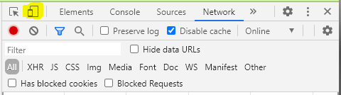
3. At the top of the panel on the left-hand side, you will see an icon that will toggle the mobile simulator toolbar, click the icon one time to turn it on
4. You should see a toolbar display, click the list arrow to select a mobile device and view your page. Select the different mobile devices and scroll through the page to make sure it looks the way you want it to.
5. Turn off the mobile simulator by clicking the icon toggle.
1. FTP everything in the Lesson 11 folder to the main directory on the server. You should have the following items in the folder:
Acme-Vertical folder 7 points
zen folder 18 points
2. After ftping, you should check the pages "live". If there are errors, you should correct them, then transfer the pages again and check them. For each of the folders, you will need to enter lisabalbach.com/yourUserName/Acme-Vertical/home.html and lisabalbach.com/yourUserName/zen/home.html Make sure you replace yourUserName with the username your nmc username (that is how your accounts were set up on the system)