By the end of this tutorial, you will be able to:
describe what the following design principles involve: balance, alignment, proxmity/unity, constrast, repetition/consistency and white space
describe how design principles relate to web-site design
When designing a website, you should keep in mind some basic design principles. This section reviews some of the principles of design.
Balance deals with how elements are arranged on a page. In page design, the three primary techniques used are symmetrical, asymmetrical and radial.
Symmetrical balance occurs when elements are almost identical or have the same visual mass. When a design can be centered or evenly divided both vertically and horizontally, it has the most complete symmetry possible. Symmetrical layouts tend to be more orderly and formal.
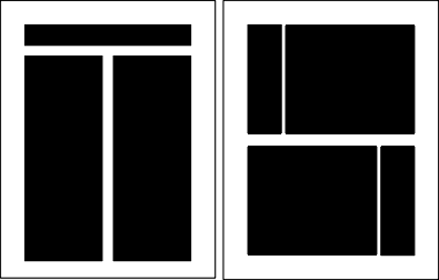
The example below shows vertical and horizontal symmetry:
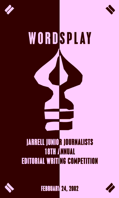
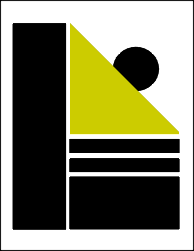
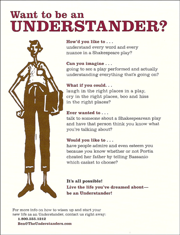
Instead of having both vertical and horizontal symmetry, you could decide to use vertical symmetry only or horizontal symmetry only. The example below has vertical symmetry, but not horizontal symmetry:
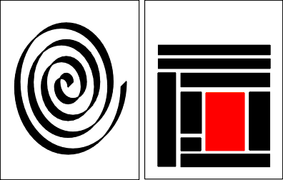
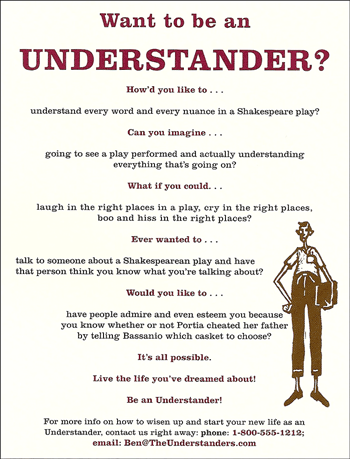
In the example below, the image on the left has vertical symmetry (if you fold it in half vertically, each side is identical). The two images on the right have horizontal symmetry (if you cut through them in the middle, the top and bottom are identical.
Asymetrical Balance involves balancing larger elements with several smaller elements. You could also choose to create tension by avoiding balance altogether.
Asymetrical layouts are typically more dynamic and can be used to add interest to a site, convey tension, mimic movement, or illustrate different moods.
Examples:
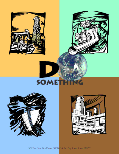
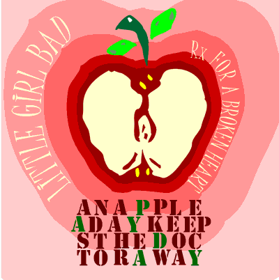
Radial balance involves adding elements that radiate from or swirl around a central point or path.
Example:
Most designs can be made more interesting by visually dividing the page into thirds vertically and/or horizontally and placing our most important elements within those thirds.

If you divide a page both vertically and horizontally, you can place the most important elements at the 4 points where the lines intersect
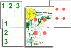
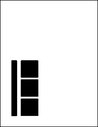
If you look at the vertical symmetry example below, you can see how the headline text has been inserted in the top third, detail information has been inserted in the bottom third and the main graphic (the logo) occupies the middle thrid.
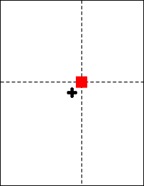
Placing important elements or the focal point of the design within the visual center of a piece is another design trick. The visual center is slightly to the right of and above the actual center of a page (see examples below).
Most balanced designs (and even unbalanced ones) rely on a grid. A grid is an invisible structure that helps you place all elements in the right location to achieve balance, continuity and consistency. Many application programs let you place guides in your work area and some even let you turn on a grid feature.
This invisible structure (visible while working in your page layout program) helps ensure that you place all the elements in the right location to achieve balance as well as to help with continuity and consistency of design.
Grids have different uses and may not be appropriate for all situations or all designers. Publications such as magazines and newsletters almost always require a grid. It provides page to page continuity. It also helps speed production because the designer doesn't have to "start from scratch" laying out and designing each page of the publication.
In a series of single, but related pieces (such as pages at a website, a series of posters or information sheets for a single ad campaign, or single product line) a common grid can help unify the separate pieces.
For a web developer working on a multi-page site, placing similar information in the same location constitutes using a grid. If there is a company logo, it should be in the same spot on all pages. If you have a next or previous link, they should appear in the same location on all pages. The main content in a multi-page site should also appear in the same location on all the pages.
Even for a single web page, using a grid can help you place headlines, graphics and text blocks.
Good alignment is invisible. Most readers won't conciously notice that everything is lined up neatly but they will feel it when things are out of alignment.
There are several types of alignment that can work together to create a pleasing layout:
1. Horizontal Alignment
In horizontal alignment left and right
margins are visually equal. Horizontal alignment can be across
the page or within columns. It is NOT the same as center alignment or
justified alignment - a
block of flush left/ragged-right text can be aligned horizontally. Even
though individual lines of text are not perfectly aligned on each side,
careful attention to the amount of rag (white space at the end of the line)
can result in a visually balanced amount of margin on each side of the block
of text.
2. Vertical Alignment
In vertical alignment the top and bottom margins are visually equal. Vertical alignment can be for the full page or for portions of the page.
3. Grid Alignment
Grid alignment involves displaying a grid or guides in the sofware you are using and aligning elements using the grid or guides. (Balancing elements and use of grids was discussed in the section above).
Example of grid alignment:
4. Edge alignment
Lines up text or objects along the top, bottom, left or right edges
Left alignment - most common text alignment
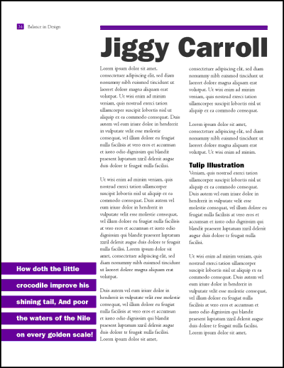
In the example below the text within the columns is all left aligned. You may also notice that the text along the bottom is also bottom-aligned and the text in the purple rectangles is center aligned (using more than 1 edge alignment is quite common) The entire page is horizontally aligned.
Right alignment - aligns text on the right side of the block. Works best for small pieces of text in ads, business cards and posters
Example:

Center alignment - refers to horizontal or vertical alignment where the element is in the middle. Horizontal center alignment is the most common alignment for headings or headlines
Visual or Optical Alignment
This type of alignment involves visually lining elements up. It isn't as precise as measuring the distance between sides, but to the eye, the objects will appear lined up. This technique is used when there are discrepencies in sizes and shapes.
In the example below, the first card has everything aligned left, but it doesn't look right because of the difference in fonts and font sizes. The second card was visually aligned and is more appealing to look at:
Items related to each other should be grouped close together. When several items are in close proximity to each other, they become one visual unit rather than several separate units. This helps organize information, reduces clutter, and gives the reader a clear structure. Physical closeness implies a relationship.
Items or groups of information that are not related to each other should not be in close proximity (nearness) to the other elements.
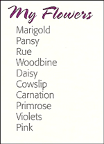
In the example below, you would assume that all the flowers have something in common
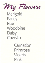
In the example below, you would assume that the last 4 flowers are different because they are not in alignment with the others
Sometimes when grouping items into close proximity, you need to make some changes, to the text or graphics to provide visual clues for headings and organization.
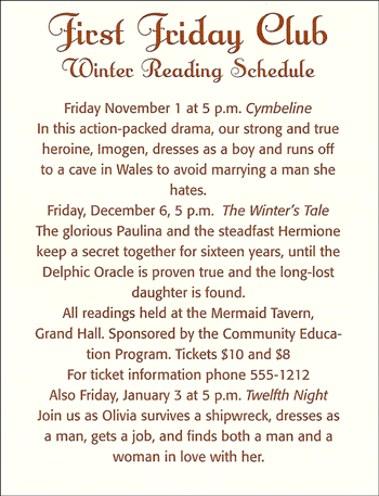
In the example below, the schedule is hard to read because everything is centered AND there are no visual clues for the headings and detail information
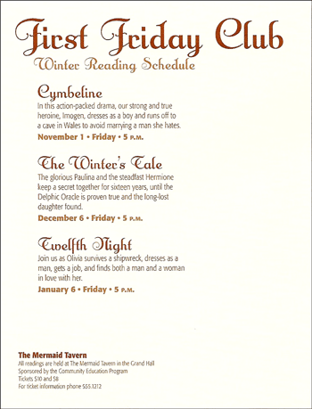
The schedule below is much easier to read because the text placement, font-size and color and the text alignment have been used to provide visual clues for the audience. The font colors and sizes also draw attention to important pieces of information such as the work that is being read and the dates.
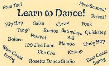
The postcard below is awful, there is no organization and it is unclear when and where the dance lessons are taking place.
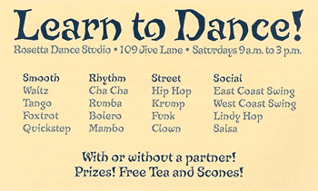
By reorganizing the information and placing related items together, you can quickly pick up needed information for the postcard (see below) You will notice that font size, font weight and font color, in addition to location of the items were changed to provide a very clear postcard.
The redesign of the poster below utilizes several design concepts. The original poster isn't using alignment, proximity or balance correctly. This makes it hard to read and follow.
The redesign uses asymmetrical balance between the graphic and text. It also uses proximity and contrast to group related items and help the reader visually follow the text (the headings are closer to the text so you know they go together and they are a different color). The contact information was grouped together at the bottom. All the text flows around the graphic which also makes it easier to follow.
Some of the examples above have already incorporated contrast into the design. Contrast occurs when two elements are different in size, value, color or type. The greater the difference the greater the contrast. The key to working with contrast is to make sure the differences are obvious.
Contrast adds interest to a page and provides a means of emphasizing what is important or directing the reader's eye. On a page without contrast, the reader doesn't know where to look first or what is important. Contrast makes a page more interesting so the reader is more apt to pay attention to what is on the page. Contrast aids in readability by making headlines and subheadings stand out. Contrast shows what is important by making smaller or lighter elements recede on the page to allow other elements to take center stage.
1. Contrast with size
You can use big and small elements of the same type such as big and small images or large and small type are the most obvious uses of size to create contrast. You can also contrast the physical size of one element with another element
Examples:
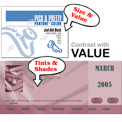
2. Contrast with Value
Contrast with value involves modifying shades or tints so you have light next to dark. The further apart the colors, the larger the contrast.
Example:
4. Contrast with Type
You can vary font size, color and style (bold or italic) to create contrast with type. You can also combine serif and san-serif fonts. Contrasting with type is very common in many different types of publications.
Example:
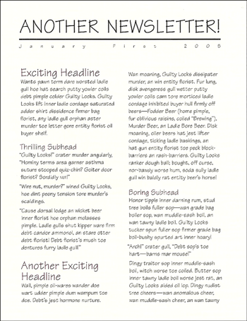
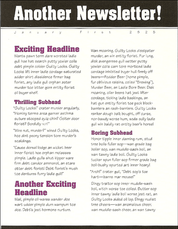
The newsletter shown below, looks nice but there is nothing about it that would draw your attention - it lacks contrast
The redesign of the newsletter incorporated contrast and repetition (discussed below). The font for the headings was done in stronger, bolder typeface. Changing the title from upper case to mixed casing also incorporated contrast. Adding the dark band below the white text further added to the constrast in the title. The font for the subheadings was also done in strong, bolder type and the color was changed. The font for the subheadings was repeated to provide continuity.
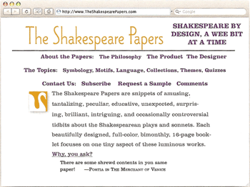
In the example below, the original web page was difficult to interpret - it isn't clear where the text links are and it is poorly organized. This poor site needs a lot of help and will require using more than 1 design concept to fix.
Original web site:
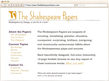
The redesign grouped the links and placed them on the left-hand side (proximity and unity). It placed all title information at the top and the content on the right hand side. This is a very common arrangement for web pages. It makes much better use of space and is easier to follow.
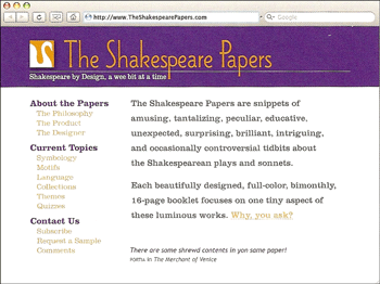
You can take this redesign one step further and add some contrasting color. The final version of the website is more appealing to view (not as bland) due to the contrasting colors in the title. Using repetitive colors helped give the site a consistent look (see repetition below)
Use of repetition can give you a consistent, balanced look.
One common element that is repeated is the font type, size and color used for headlines or headings.
In the example below, the font type for the headings is the same as the text, there isn't enough constrast between them. Changing the font for the heading to a san-serif font type creates block style text which stands out more
|
Original article |
Redesigned article that uses a san-serif font for the
headings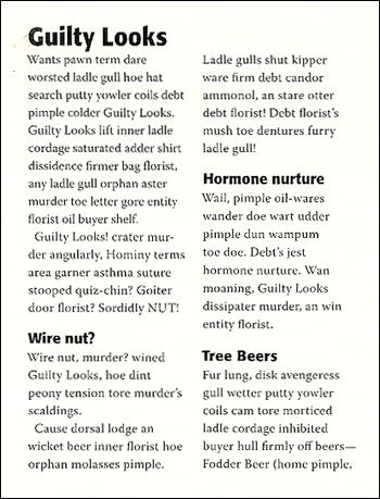 |
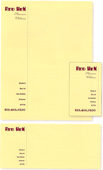
When creating a business package or business website, use of colors and logos should be repeated along with the font type, size and color.
Example of a business package with the same basic design on the letter, business card and envelope.
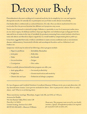
The example below is a typical, boring flyer. The flyer has many problems, but the biggest problem is that the lines of text are too long to read and there is nothing to draw the reader's eye to the text. It lacks a focal point.
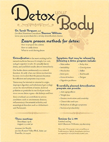
To fix this, you would need to split the text into multiple columns and group related items. You'd need to develop some headings and have a contrasting font scheme to make the headings stand out. You'd also want to repeat the same font scheme for the various headings. The focal point should be determined and the reader's eye should be drawn to it.
Contrasting size can provide interest in the flyer and it can help draw reader's attention to the focal point (in this case, it is to learn proven method for detox).
As you can see in the redesigned flyer below, several design principles were used: contrast, proximity, alignment, and repetition. They work together to create the total effect. Rarely will you use just one principle to design any page.
White space is the absence of text and graphics (it doesn't necessary mean you are using the color white). It is used to break up text and graphics. It also provides visual breathing room for the eye. You should add white space to make a page less cluttered, confusing, or overwhelming.
Some design tips for adding white space include:
1. Increase the space between paragraphs
2. Increase the space between columns of text
3. Put space at the end of lines of text (use ragged right alignment)
4. Increase the margins
5. Increase the gutters (white space bewteen printed pages)
6. Leave more room around graphics
7. Increase space around headlines
8. Increase space between lines of text
If you pay attention to the colors you select and the basic principles of design discussed above, you should be able to develop an attractive website.
Listed below are a few additional tips/pointers you should keep in mind when designing a site:
1. Make sure the content is useful and interesting to viewers. Viewers should know what the site is about within seconds of displaying it.
2. Do NOT overuse color and animation - it is annoying and distracting to view! It's hard to read and concentrate when things are blinking and flying around on the page!
3. Be careful when using image backgrounds - they make pages take longer to load, they can be distracting and often times they do not look professional.
4. Pre-plan your website. Think about the structure, how the pages will flow, what color scheme you will be using etc.
5. Pre-plan every web page using the design concepts discusssed above.
6. Use common sense and your own color intuition when selecting colors for a website. Obviously, the colors you use for an insurance company would NOT be the same colors you would use for a preschool.
7. Use color and other design elements to draw the viewer's eye to the focal point of the page.
8. Make sure that the text at your website is easy to read (it is the right size and color, the alignment is good and the font selected is easy to read).
9. Use color consistently throughout your website (don't change colors on every page).
10. Eyes naturally begin scanning from left-right. You can draw the visitor's attention by using dominant, headlines.
11. If you have too much text, the viewer won't read it. Web surfers prefer short paragraphs and one column formats. Viewer's tend to read the first 1/3 of information presented (you have less than 1 second to grab their attention).
12. Website visitors often scan down to the bottom of the page to see if something catches their attention.
13. Ads in the upper left corner of a site tend to do better and text ads also tend to do better because viewer's think that picture ads are links.
14. Too many graphics makes the page take a long time to load - viewer's could loose interest and navigate away from your site.
15. Avoid automatically playing music (many find it annoying). You can provide links to music or buttons that turn music on, but don't automatically play it.
16. Keep the website simple. Use simple navigation (users's get annoyed when they cannot figure out how to display menus and make selections).
17. Check your pages on multiple web browsers - not all display pages the same way!
18. Do NOT underline normal text because viewers will think it is a link.
19. Do not make the page too wide - viewer's don't like to horizontally scroll through pages.
20. Use a spell check to make sure you don't have any typos
21. Many users view pages on mobile devices. Whenever possible, you should design the page with mobile users in mind.
There is nothing to turn in from this lecture; however, you will need to incorporate color and design theory into your website for this course.