
By the end of this tutorial, you will be able to:
Use the traditional and flexbox box models to create content in pages.
Control website layout using CSS
Explain how flexbox models differ from traditional
Explain what virtual boxes are and how they are created.
Browsers create a virtual box around each element when determining the area they occupy.
The virtual box can contain content and additional html elements. When a box contains elements, it is called a container or containing block.
Example: In the example below, the section element is a containing block for the paragraphs inside it. The 2 paragraphs inside the section are limited to a width of 300 pixels because the containing block (i.e. the section element) is set to a width of 300 pixels.
<section style="width:300px;">
<p>Paragraph 1</p>
<p>Paragraph 2</p>
</section>
The space occupied by the virtual box includes:
In the example below, the blue area is padding, the green area represents the border and the purple area represents the margins. When you combine the content area + padding + border + margins, you have the space the box occupies.
A few things to keep in mind about the box include:
To see how this works live, view: https://www.w3schools.com/css/tryit.asp?filename=trycss_boxmodel Try adjusting the width and click run. Then adjust the padding and click run. Adjust the margin and click run. Adjust the border size and click run. Notice how the box changes each time.
The virtual boxes line up side-by-side (inline) or stacked vertically (block). Boxes that are inline will wrap when the window border or the containing box border is encountered
HTML elements, by default, either display inline or block.
Structure elements such as <section>, <nav>, <article>, <header>, <footer>, <p>, <div>, <h1> etc. are block by default.
Content elements like <em>, <strong>, <span>, <img>, <a> etc. are inline by default.
The example shown below, illustrates this concept (notice how the inline elements wrap to the next line; whereas, the block elements are stacked vertically). block labeled content5 in the example below wraps to the next line):

Retrieved from HTML5 Masterminds, October 1, 2017
Using the CSS display property, you can control how an element displays.
The display property can set how an element displays in relation to other content on the page.
Syntax: display:value
Where value can be:
To see how changes to display affect the way the text displays, go to: https://www.w3schools.com/css/tryit.asp?filename=trycss_display_inline_list and change display:inline to display:block; then click the Run button. Change display to display:inline-flex; then click the Run button
HTML elements that contain other HTML elements are called containing blocks or parent blocks. In the following code, the <section id="container"> element is a containing block for the <section id="box"> element and the paragraph blocks. The <section id="box"> element is a containing block for the paragraph blocks. The paragraph blocks are containing blocks for the text.
<section id="container">Container Box
   <section id="box">
     <p>Inner Box whose dimensions are affected by the container
        The margins, alignment and width of the inner box
        are also affected by the container. The orange area
        is the border for the inner box.</p>
   </section>
</section>
Because containing blocks are limiting the space for the content to display, it is recommended that the overflow property be set to auto which would allow scrollbars to display if all the content isn't visible.
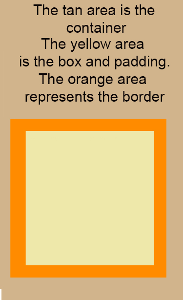
Here's an example of CSS used to create a container and a box element (note that they are set up as IDs so they can be applied to any element):
#container {
width:300px;
height:500px;
background-color:tan;
overflow:auto;
}
#box {
width:200px;
height:200px;
background-color:palegoldenrod;
color:black;
border:20px darkorange solid;
padding:10px;
margin:10px;
}
Here's how it looks in the web browser
Here's how it looks live: box-example1.html (to view the code, right click the page and select the view source command).
Explanation of how the box model works:
The container (or parent) should be larger and must be defined first. Within that block you can place additional boxes of content. The containing block will be used to determine the position of the boxes within it and in some cases, the dimensions of those boxes. For example, if an element has a style setting of width:50%; the width is measured based on its containing block (not the width of the page). If the containing block has a width of 300 pixels, any blocks defined within it are constrained by the 300 pixels. So, if you specify a width of 50% for an inner block, it will occupy 50% of the 300 pixels.
The containing block is considered to be the content's edge. If there isn't a containing block, the browser window serves as the containing block.
Containing blocks will typically be elements that divide a page into segments, like the <article>, <section> or the <div> element. You would use <article> or <section> if you have content you want to group together. If you only want to apply formatting, then you should use <div>.
There are two primary box models in use: Traditional and Flexible
Alignment of boxes is modified using the float and clear properties as illustrated below.
When an element floats, content flows around the element. If the element floats to the left, content flows around it on the right-hand side. If the element floats to the right, content flows around it on the left-hand side (this is the property we used with images to get content to flow around the image)
Syntax: float:value
Where value can be:
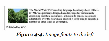
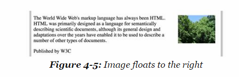
To see a live example with an image and text, view: https://www.w3schools.com/cssref/tryit.asp?filename=trycss_float
Clear returns the flow of the document back to the defaults.
Syntax: clear:value
Where value can be:
If you overuse float, browsers can get confused and may not display the page correctly. clear:both; can be used to reset the page and fix the problem.
Positioning gives you a little more control over where the boxes display. There are 5 position values: static, relative, fixed, absolute and sticky
These values are used in conjunction with the top, bottom, left or right properties. You basically tell the browser what the positioning scheme is and then the location values you want to use.
You must set the position property first followed by top, bottom, left or right.
Syntax position:value;
Values include:
To see a live example that uses relative and absolute containers, view: https://www.w3schools.com/css/tryit.asp?filename=trycss_position_absolute
Typically, if you set the position property, you also set top, left, right or bottom to tell the browser where to put the container.
Syntax: top:value; or bottom:value; or right:value; or left:value;
Where value is typically measured in pixels because that is how monitors measure space. You can set more than 1 property such as top and left or top and right
NOTE: All the examples above in the position section use left, top, right or bottom properties.
Here's another example:
<p style="width:100px; border:red 10px solid; position:relative; left:30px;padding:10px;">This paragraph has a lovely red border and is 30 pixels left of the current position in the document</p>
Here's how it looks live:
This paragraph has a lovely red border and is 30 pixels left of the current position in the document
In this scheme, block boxes flow vertically starting at the top of their containing block with each placed directly below the preceding one.
Example of how block boxes flow:
Inner Box 1
Inner Box 2
Here's the code used:
<div id="container" style="width:300px;border:solid 2px
black;">Container Box
<div id="box" style="height:100px; width:200px;border:solid
2px black;">
<p>Inner Box 1 </p>
</div>
<div id="box" style="height:100px; width:200px;border:solid
2px black;">
<p>Inner Box 2 </p>
</div>
</div>
NOTE: The height and width of the two inner boxes was adjusted so they
could easily fit into the container.
Inline boxes
flow horizontally from left to right.
Example of how inline boxes flow:
Box 1
Content Area of the Rectangular Box
Box 2
Content Area of the Rectangular Box
Here's the code used:
<div id="container" style="width:650px; height:400px;border:solid
2px black;">
The outer box is the container
<div id="box" style="float:left;border:solid
2px black;">
<p>Box 1</p>
<p>Content Area of the Rectangular
Box</p>
<p>Content Area of the Rectangular
Box</p>
</div>
<div id="box" style="margin-left:300px;border:solid
2px black;">
<p>Box 2</p>
<p>Content Area of the Rectangular
Box</p>
</div>
</div>
A few things to note about traditional inline boxes:
1. The container must be wide enough to display all boxes horizontally OR the boxes will wrap to the next line
2. The elements used to produce the boxes are block elements (not inline elements). To display them side by side requires using the float property for the first box (the box you want to "wrap" content around). The first box will need a style of float:left;
3. To position box 2, you need to adjust the left margin. You could also use float:right; However, that may not look good in a wider container because the content will move to the far right instead of right next to the content on the left-hand side.
Make sure you include the DOCTYPE statement in your html. If you omit the statement, IE will not use the height and width settings for your boxes and your results will not look very good.
With absolute positioning, you are setting the exact locations of the content on the page. This method is NOT nearly as flexible as the other positioning schemes and it doesn't adjust for different screen sizes and monitor resolutions. If you plan on having mobile users view your pages, this is NOT a good method to use because it may display scroll bars if the screen isn't wide enough to display everything.
To see an example, go to: absolute-positioning-example.html (To see the CSS used, right click and select the view source code option in the menu). With absolute positioning, you can position a box outside it's containing element (there is nothing to prevent you from doing that).
With absolute positioning, you can have containers overlap. If this occurs, the browser will use the z-index to determine which element to display on top.
Absolutely positioned elements may overlap non-positioned elements and each other. The two things that determine which element appears in front of, or behind, another are the stacking context and the z-index property.
The stacking context refers to the order items are rendered on the page. Items rendered first are on the bottom. Items rendered last are on the top.
The z-index can be used to change the stacking order. Low numbers are on the bottom and high z-index numbers display on top.
Example: testing-z-index.html (to see the code, right click and select view source code from the menu)
The goal of the Flexbox Layout is to provide a more efficient way of laying out, aligning and distributing space among items in a container (even when the size is unknown or dynamic).
The main idea behind the flex layout is to give the container the ability to alter its items' width/height (and order) to best fill the available space. It is designed to handle all types of display devices and screen sizes. Flexbox isn't locked into a direction (like block or inline).
A flex container expands flex items to fill available free space, or shrinks them to prevent overflow. Understanding what a flex container and flex item are is important when using Flexbox.
Basically, a flex container is a parent element (it includes other elements between the opening and closing tags).
A flex item is a child element which means it is located inside a container or parent element. A flex container can hold one or more flex items.
NOTE: You may see the -webkit- prefix on flexbox values and flexbox CSS properties because older browsers don't recognize the commands. We are not going to be using the prefix because all current browsers and mobile devices recognize flexbox.
The first step in using Flexbox is to create the parent container element and set it's properties which will determine the direction and flow of the child elements.
To create a container, you need to use the display property and set it to flex or inline-flex
Syntax: display:flex; or display:inline-flex;
Flex displays render vertically (ie block)
Inline-flex displays render horizontally
Flexbox is a single direction layout - you can layout content in rows or columns. you can use the direction or flex-direction properties to modify direction
The default direction is left to right (ltr) You can change the direction to rtl (right to left)
Syntax: direction:rtl;
NOTE: this directional change is typically done in the body tag
To see a live example, view: https://www.w3schools.com/css/tryit.asp?filename=trycss3_flexbox_flexline_rtl
This property has more choices than direction and you can layout content from left to right, right to left, top to bottom or bottom to top
Syntax: flex-direction:value; -webkit-flex-direction:value;
Where value can be:

Retrieved from https://css-tricks.com/snippets/css/a-guide-to-flexbox/ on October 5, 2017
To see an example, view: flexbox-direction-demo.html To see the code that was used to create the example, right click on the page and select View Page Source
By default, flex items try to fit on one line. You can modify the behavior using the flex-wrap property.
Syntax: flex-wrap:value; -webkit-flex-wrap:value;
Where value can be:
To see an example of how this works, view: flexbox-wrap-demo.html To see the code that was used to create the example, right click on the page and select View Page Source
To play with an interactive example, view: https://www.w3schools.com/css/tryit.asp?filename=trycss3_flexbox_nowrap change nowrap to wrap and click Run. Then change wrap to wrap-reverse and click Run.
Flex-flow can set both the flex-direction and flex-wrap properties
Syntax: flex-flow: flex-direction || flex-wrap;
The default value is flex-flow:row nowrap;
Values for flex-wrap can be: nowrap, wrap, wrap-reverse
Values for flex-direction can be: row, row-reverse, column, column-reverse
Lets you distribute leftover space horizontally.
Syntax: justify-content:value;
Where value can be:
Example:
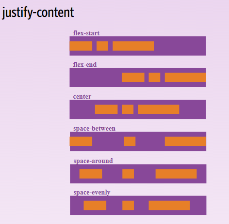
Retrieved from
https://css-tricks.com/snippets/css/a-guide-to-flexbox/ on October 5,
2017
To see a live example, view: https://www.w3schools.com/css/tryit.asp?filename=trycss3_flexbox_justify_flex-end Change flex-end to flex-start and click Run. You should see the items move to the left. Change flex-start to space-between and click Run. You should notice the items are now evenly spaced within the container.
Defines how items are vertically laid out within the container
Syntax: align-items: value; -webkit-align-items:value;
where value can be:
Example:
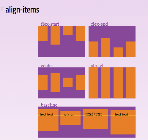
Retrieved from https://css-tricks.com/snippets/css/a-guide-to-flexbox/ on October 5, 2017
To see a live,interactive example, view: https://www.w3schools.com/css/tryit.asp?filename=trycss3_flexbox_align_flex-start Change flex-start to flex-end and click Run. Change flex-end to center and click Run.
Once you have the parent container defined, you can define elements within the container which are referred to as children. There are properties how the child element is displayed, the size of the child element, and the alignment of the element.
Order controls the order items appear within the flex container. By default, flex items are laid out based on how they appear in the code.
Syntax: order: value;
To see an example of how this works, view: flexbox-item-demo.html
To see an interactive example, where you can adjust code, view: https://www.w3schools.com/css/tryit.asp?filename=trycss3_flexbox_order Adjust item 3 by adding an inline style for order and setting it to -2 like this: <div class="flex-item" style="order:-2;">flex item 3</div> Click run and you will notice that the flex item 3 box is now first.
Setting margin: auto; will absorb extra space. It can be used to push flex items into different positions. It can also be used to center an item within the container.
Example of an item with default margin settings
Example of an item with margin:auto;
This property affects the vertical alignment of a single child element and overrides the align-item parent container property.
The values are the same as the parent container align-item property. The difference between this property and the parent container align-item property is that align-item affects all items within the container and this property only affects the ONE item it is applied to.
Syntax: align-self: value;
where value can be:
To see an example, view: flexbox-alignment-demo.html
To play with an interactive example, view: https://www.w3schools.com/css/tryit.asp?filename=trycss3_flexbox_align-self Practice changing the different values for each item. For example, change item 1 to center. Change item 2 to stretch etc.
Specifies the length of an item relative to the rest of the items inside the same container.
Syntax: flex:value;
Where value is a number. The default is a value of 1.
A value of 2 would make the item double the size of items with a value of 1.
A value of 3 would make the item triple the size of an item with a value of 1.
Remember that values are relative to the size of the container.
To see how this works, go to: https://www.w3schools.com/css/tryit.asp?filename=trycss3_flexbox_flex_number For item 2, change -wekit-flex:1; and flex:1; to the number 3 and then click run. You will notice that item 3 is the thinnest because it is set to 1. Item 1 is double the size with a value set to 2 and item 2 is triple the size with a value set to 3.
CSS includes variations of the flex-property that are designed to set initial values, grow or shrink an item. The variations include: flex-grow, flex-shrink and flex-basis.
a. flex-grow property
Makes the item wider (bigger) relative to other items within the same container.
Syntax: flex-grow:value;
Where value is a number. The default is zero which means, it isn't any bigger than other items. You cannot use negative numbers.
b. flex-shrink property
Makes the item thinner smaller) relative to other items within the same container.
Syntax: flex-shrink:value; -webkit-flex-shrink:value;
Where value is a number. The default is 1. Negative numbers aren't valid.
c. flex-basis property
Defines the default size of an item before the space is distributed. Values can be percentages, a number or auto
Syntax: flex-basis:value; -webkit-flex-basis:value;
There are 4 different combinators you can use to help control which elements css is applied to. The combinators can be used with any elements and you can use them with box elements to limit which items are child elements or flexbox items.
The 4 combinators include:
So far, we have worked with width and height properties. As you could see when we started using flexbox, container widths and heights were adjusted automatically. You can control the maximum and minimum settings for height and width using the following properties:
Sets the maximum width for an element
syntax: max-width:value;
Where value typically is a percentage or the number of pixels (although you can use any numeric unit)
Sets the minimum width for an element
syntax: min-width:value;
Where value typically is a percentage or the number of pixels (although you can use any numeric unit)
Sets the maximum height for an element
syntax: max-height:value;
Where value typically is a percentage or the number of pixels (although you can use any numeric unit)
Sets the minimum height for an element
syntax: min-height:value;
Where value typically is a percentage or the number of pixels (although you can use any numeric unit)
CSS3 includes a few styles designed for use with boxes. The box-shadow property adds a shadow effect to boxes. The border-radius property rounds the ends of boxes producing a rounded rectangle or rounded square.
A box shadow was added to the element above so you can see what it looks like. The concept is similar to text-shadow, but the shadow is being applied to the box instead.
With a box shadow, a width and border are typically specified in addition to the box-shadow property
Example:
<h5 style="box-shadow:2px 2px 1px black; width:200px; border:2px solid red;">1) box-shadow</h5>
Syntax: box-shadow: xValue yValue blurValue color;
Where
A border-radius of 25px was added to the element above so you can see what it looks like.
As you can see, border-radius creates a rounding effect on the corners. The larger the number of pixels, the more rounding that occurs.
The property is used in conjunction with the border property, width property and the padding property.
Example:
<h5 style="border:4px solid
navy;border-radius:25px;width:200px;padding:5px;">2) border-radius</h5>
Syntax: border-radius:value;
or
border-radius:topLeft topRight bottomRight bottomLeft