
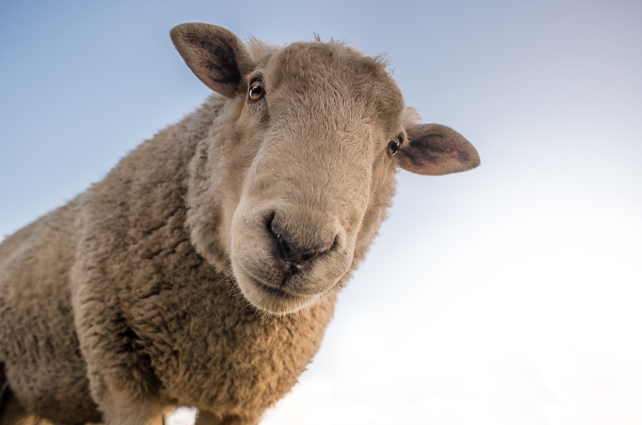
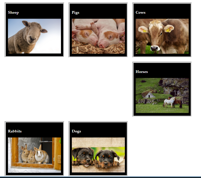
By the end of this tutorial, you will be able to:
Use the traditional and flexbox box models to create content in pages.
Control website layout using CSS
Explain how flexbox models differ from traditional
Explain what virtual boxes are and how they are created.
To see a video demonstration, watch: https://youtu.be/QW17N24VNvg
1. Open your CIT180 folder and create a Lesson6 folder
2. Open the Lesson6 folder and create a media folder AND a css folder
3. Download the following files to the Lesson6 folder:
4. Download the following files to the Lesson6/media folder:
5. Download the following file to the Lesson6/css folder
To see a video demonstration, watch: https://youtu.be/ML-JpdAXL-E
1. Open farm.html for editing
2. View the file in the web browser and look at the internal style sheet.
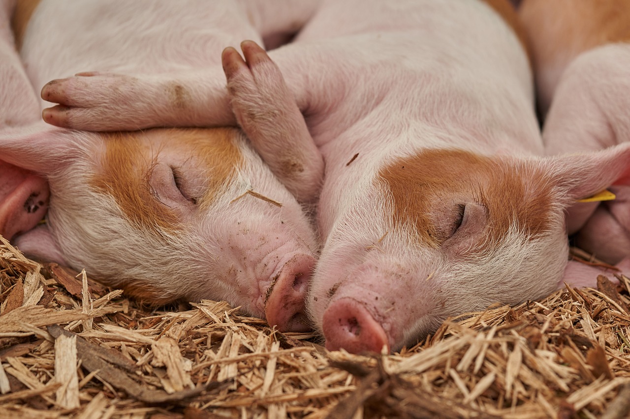
3. You will be adding code for a parentBox ID and a child class. The parentBox ID is already applied to the section element in the HTML. The child class is already applied to all elements that contain headings and images.
Example of current HTML code:
<section id="parentBox">
	<div class="child">
		<h3>Sheep</h3>
		<img src="media/sheep.jpg" alt="sheep" />
	</div>
4. Add the code shown below to the child class in your internal style sheet, save your changes and view the page in the web browser:
.child {
	width: 25%;
	padding: 1%;
	border: 10px groove white;
	margin: 1%;
	background:black;
}
5. To put some space between the child and the edge of the parentBox, add the following CSS for the parentBox ID to the internal style sheet:
#parentBox {
	padding: 2%;
}
6. Save your changes and view the page offline in the web browser.
7. By default, the child containers display vertically. To display them horizontally, we will use the CSS float property.
Modify the child class by adding the following style:
.child {
	width: 25%;
	padding: 1%;
	border: 10px groove white;
	margin: 1%;
	background:black;
	 float:left;
}
8. Save your changes and view the page in the web browser. You should notice a little problem with images in the second and third rows - the browser gets confused regarding how to display them. This problem is not unusual when using float to align content.
To fix the problem, we need to use clear:both; This CSS command clears out the current float settings, so the browser can accurately apply any float commands that follow.
9. We will add a clearfloat class to our internal style sheet and then apply it in the HTML
Add the following class to the bottom of the internal style sheet above the </style> tag:
.clearfloat {
	clear: both;
}
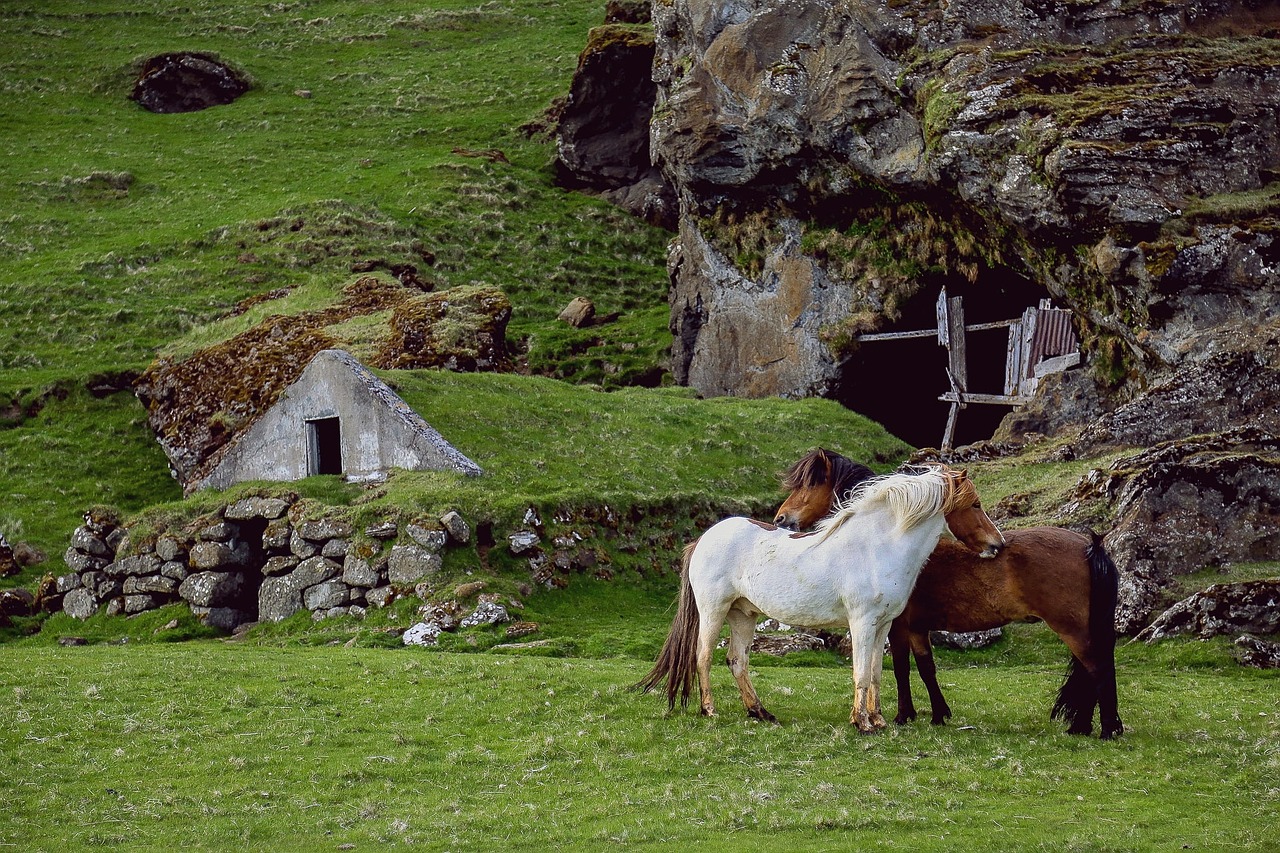
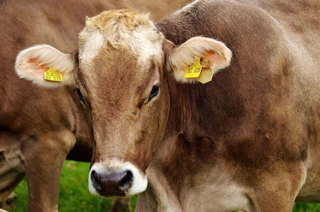
Add the following <div> between the <div> displaying the cow and the <div> displaying the horse as shown below:
<div class="child">
<h3>Cows</h3>
<img src="media/cows.jpg" alt="cows" />
</div>
<div class="clearfloat"></div>
<div class="child">
<h3>Horses</h3>
<img src="media/horses.jpg" alt="horses" />
</div>
10. Save your changes and view the page in the browser. You should notice the <div> elements containing the images line up in rows.
11. To see how the parentBox affects the child boxes, modify the CSS to the following:
#parentBox {
	padding: 2%;
	width:50%;
}
12. Save your changes and view the page in a web browser. You should notice the child elements are much smaller. We set their size at 25%. That means they are 25% of the space allocated to the parentBox. When the parentBox is only 50%, then the child elements can only occupy 1/2 of the screen width which will make them much smaller than when the parentBox is 100%;
13. Change the parentBox and remove the width setting. Add a left margin of 20% and a right margin of 20% (setting margins will also constrain the size of the child elements)
#parentBox {
	padding: 2%;
	margin-left:20%;
	margin-right:20%;
}
14. Save your changes and view the page in a web browser. You should notice the child elements are smaller because of the margin settings.
15. Correct any errors and save your changes. Keep the file open for tasks 3 and 4.
To see a video demonstration, watch: https://youtu.be/cdSZovqAlmk
1. Make sure you have saved farm.html. We are going to make a copy of the farm file and convert it into the flexbox model. After you have saved your changes from task #2, use the File Menu, Save As command and name the file farm-flexbox.html
2. Make sure farm-flexbox.html is open for editing.
3. To convert to flexbox, we need to modify the parentBox and the child class.
Change the parentBox ID to add a display of flexbox and remove the margin settings as shown below:
#parentBox {
padding: 2%;
display:flex;
}
Change the child class by removing float:left and adding flex:1
.child {
	width: 25%;
	padding: 1%;
	border: 10px groove white;
	margin: 1%;
	background: black;
	flex:1;
}
4. Save your changes and view the page offline in a browser.
5. Since we are using flexbox, we dont' need the clearfloat class. Delete the clearfloat class and the <div class="clearfloat"></div> HTML and save your changes.
6. One thing flexbox does is resize your child elements. You can set minimum and maximum widths (or heights) to have some control over the resizing. Adjust the child class by removing the width property and adding a minimum and maximum width as shown below:
.child {
	max-width: 35%;
	min-width:20%;
	padding: 1%;
	border: 10px groove white;
	margin: 1%;
	background: black;
	flex:1;
}
Save your changes and view the page offline in a web browser.
7. As you view the page in the web browser, you may notice that the page scrolls to the right because it isn't wrapping the elements. In order for the elements to wrap, we need to specify that in the parent container.
Modify the parentBox to the following
#parentBox {
	padding: 2%;
	display:flex;
	flex-wrap:wrap;
}
8. Save your changes and view the page in a web browser. Resize the browser window - you should notice the child elements resize, but do not go smaller than 20% of the width.
9. Correct any errors, save your changes and close farm-flexbox.html
To see a video demonstration, watch: https://youtu.be/UvJ_khdKr_0
So far we have been using relative positioning which is the default. With relative positioning, elements render based on their location in the HTML. You can adjust the positioning by specifying a top, left, right or bottom setting. The new position is relative to the original position (not the edge of the screen).
We are going to contrast relative positioning with absolute positioning. Absolute position uses the edge of the screen to position elements which means the rendering order of the page doesn't matter.
1. We are going to make a copy of the farm file from task #2 and work with positioning commands. You can either open farm.html and save it as farm-position.html OR you can use the file explorer, right click farm.html,select copy and then right click and select paste (if you use the copy/paste method, you will need to rename the file to farm-position.html).
2. Make sure farm-position.html is open for editing.
3. Remove the float:left; style from the child class and change the width to 200px and the height to 250px as shown below:
.child {
	width: 200px;
	height:250px;
	padding: 1%;
	border: 10px groove white;
	margin: 1%;
	background: black;
}
4. Remove the clearfloat class from the internal style sheet and in your HTML, remove the div element that contains the clearfloat class (it is no longer needed)a.
5. Remove the header styling from the internal style sheet and save your changes.
6. Add the following positioning to the H1 css as shown below:
h1 {
	font-family: Impact, Haettenschweiler, "Franklin Gothic Bold", "Arial Black", "sans-serif";
	letter-spacing: 10px;
	font-size: 3em;
	position:absolute;
	top:0px;
	left:60px;
}
If you save your changes and view the page offline, you will notice that the flexible elements overlap the title. The absolutely positioned title is in a fixed location, but the rest of the elements on the page are not. Our next step is going to involve applying absolute positioning to the child division elements.
7. Add the following IDs to the bottom of the internal style sheet. You should note that they are using relative positioning which means the top and left settings are added to the originally rendered location to come up with the new position.
#P1{
	top:100px;
	left:50px;
}

#P2{
	top:100px;
	left:300px;
}

#P3{
	top:400px;
	left:50px;
}

#P4{
	top:400px;
	left:300px;
}

#P5{
	top:700px;
	left:50px;
}

#P6{
	top:700px;
	left:300px;
}
8. Apply the IDs to the HTML as shown in the graphic below:
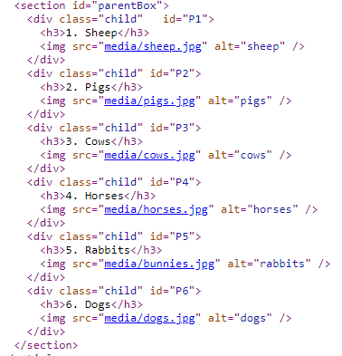
9. Save your changes and view the page - you will notice that the child division elements with the relative positioning are in a different location because the top and left settings were added to the original position settings.
Instead of positioning relative to the current location, we would like to position based on the top and left of the page (or screen). So, we are going to change the positioning to absolute. Adjust the ID's by adding position:absolute; as shown below:
#P1{
	position:absolute;
	top:100px;
	left:50px;
}

#P2{
	position:absolute;
	top:100px;
	left:300px;
}

#P3{
	position:absolute;
	top:400px;
	left:50px;
}

#P4{
	position:absolute;
	top:400px;
	left:300px;
}

#P5{
	position:absolute;
	top:700px;
	left:50px;
}

#P6{
	position:absolute;
	top:700px;
	left:300px;
}
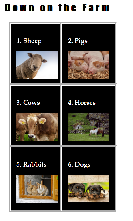
Save your changes and view the page offline in the browser - you should notice that the elements are now aligned to the screen (or page) and no longer overlap the title. Your screen should resemble the graphic below:
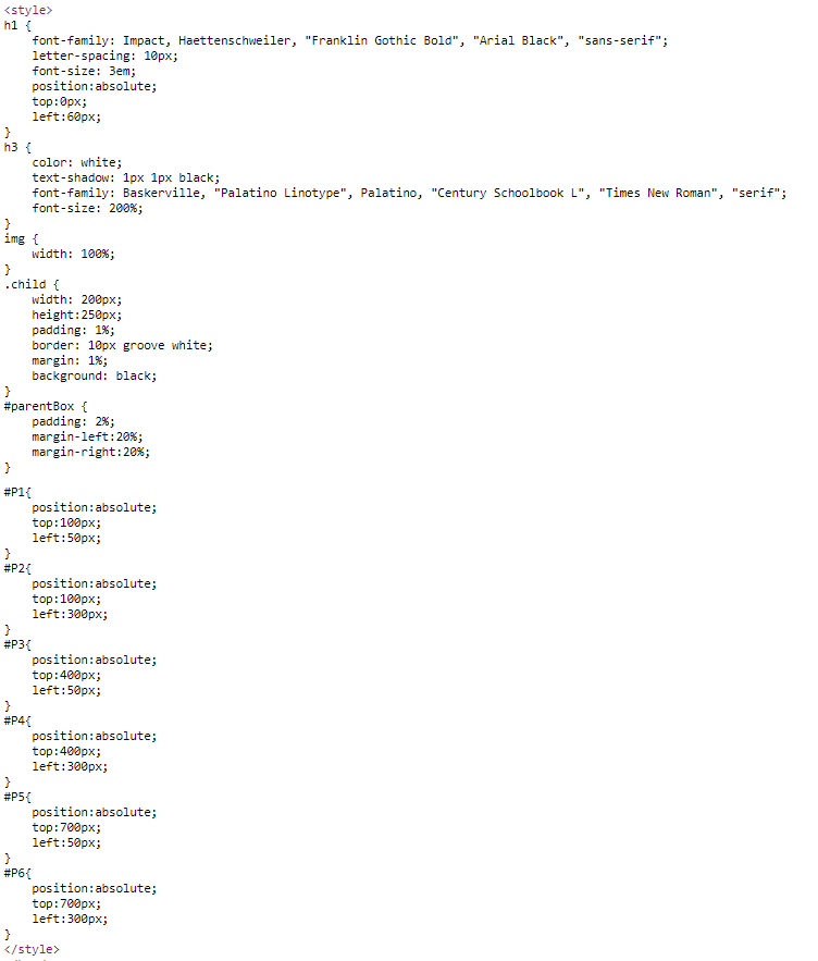
10. There is one last adjustment we are going to make. Because we are using absolute addressing, we do not need float:left; in the child class (it is basically being ignored). After you remove the code from the class, your completed css should look like the example below:
11. Correct any errors and save all your changes. Close farm-position.html and farm.html (we are done with both files)
To see a video demonstration, watch: https://youtu.be/QEZ72WAjK1E
1. Open song-snippets.html for editing
2. Open song-snippet.css for editing
3. Modify the section css in song-snippet.css to ONLY change section elements when they are inside article elements (this requires modifying the code to use a CSS combinator)
Either article section or article>section will work with our HTML file because the section element is a direct child of article in our HTML
In our file, they are the same thing.
You can use either option:
article>section{
	border:1px solid #0C178F;
	background-color:lemonchiffon;
	width:300px;
	padding:10px;
}
or
article section{
	border:1px solid #0C178F;
	background-color:lemonchiffon;
	width:300px;
	padding:10px;
}
4. Modify the #parent ID to make it a flexbox parent container (by default everything inside the container will be flexible content). Then modify the article section CSS to indicate it is a child container by adding flex:1 to the CSS and by adding a max-width and min-width setting.
#parent{
	background-color:#0C178F;
	padding:20px;
	display:flex;
}
article>section{
	border:1px solid #0C178F;
	background-color:lemonchiffon;
	width:300px;
	padding:10px;
	flex:1;
	max-width:400px;
	min-width:250px;
}
Save your changes and view the page offline.
5. To control how the child elements display, add the following styles to the #parent ID
flex-wrap:wrap;
justify-content:space-evenly;
align-items: stretch;
Save your changes and view the page offline to see the effects.
6. To modify the display of individual child elements, we are going to use inline styles.
Add the style attribute to the HTML as shown below:
a) Change the order of the child elements so Bridge Over Troubled Water displays first
Modify the HTML and add the following inline style:
 <section style="order:-1;">
	<h2>Bridge Over Troubled Water lyrics</h2>
	<p>When you're weary, feeling small,<br>
	When tears are in your eyes<br>
	I will dry them all<br>
	I'm on your side<br>
	Oh when times get rough<br>
	And friends just can't be found</p>
</section>
Save your changes and view the page in the browser (you should notice Bridge Over Troubled Water is first)
b) Increase the size of the Boxer and Kodachrome lyrics to 3X the size of the other child elements
Modify the HTML and add the following inline styles:
<section  style="flex-grow:3;">
<h2>Kodachrome lyrics</h2>
<p> They give us those nice bright colors<br>
They give us the greens of summers<br>
Makes you think all the world's a sunny day, Oh yeah<br>
I got a Nikon camera<br>
I love to take a photograph<br>
So mama don't take my Kodachrome away</p>
</section>

<section  style="flex-grow:3;">
<h2>The Boxer lyrics</h2>
<p>I am just a poor boy<br>
Though my story's seldom told<br>
I have squandered my resistance <br>
For a pocket full of mumbles<br>
Such are promises<br>
All lies and jests<br>
Still a man hears what he wants to hear<br>
And disregards the rest</p>
</section>
Save your changes and view the page in the browser. If you resize the browser window, you will notice that some boxes really expand in side and contract. To control the size, we can add the max-width and min-width properties to the article section css
8. To make the child containers look better, we are going to round the corners and add a box shadow effect. Modify the article section CSS and add box-border and border-radius properties as shown below:
article>section{
	border:1px solid #0C178F;
	background-color:lemonchiffon;
	width:300px;
	padding:10px;
	flex:1;
	max-width:400px;
	min-width:250px;
	box-shadow:2px 2px black;
	border-radius:20px;
}
9. View the page offline in the web browser and correct any errors. Save your changes and close the files.
By the end of the lecture and hands on exercises, you should have the following files:
From Hands on #2 (7 points)
From Hands on #3 (7 points)
Hands on #4 (7 points)
Hands on #5 (9 points)
1. Transfer everything that is in the CIT180/Lesson6 folder to the server (that includes the media folder, css folder and all their contents). To see a video demonstration showing how to transfer files for the textbook exercises, watch: https://youtu.be/Gn3IdK5iLok
2. View the pages, "live" and correct any issues or problems. Transfer the corrections
3. If you need help, send me
an email message with a link to your web page and I will look at it and get
back to you.