
By the end of this tutorial, you will be able to:
Animate 2D and 3D elements using CSS 3 transformations, transitions and animation.
Apply text and object formatting, create gradients, apply shadow effects and use web fonts.
To see a video demonstration, watch: https://youtu.be/eoBL8IyGOE4
1. Open your CIT180 folder and create a new folder named Lesson9
2. Open the Lesson9 folder and create three new folders: name the folders media, css and fonts
3. Download the following files:
4. Copy the CIT180/Lesson6/song-snippets.html file to the CIT180/Lesson9 folder
5. Copy the CIT180/Lesson6/css/song-snippet.css file to the CIT180/Lesson9/css folder
Task: To incorporate web fonts, background commands, gradients and a new technique for tooltips into an existing page.
To see a video demonstration, watch: https://youtu.be/Z2nail0pX2Q
Part 1: Adding the custom tooltip with a gradient background
1. Open famousQuote.html in your web editor (you should have downloaded the file in hands on #1
2. Review the current CSS and view the page offline in a web browser.
3. We will be adding custom tooltips that will display the philosopher who made the quote when we point at the quote itself. To accomplish this:
a) Add the <span> tags to the paragraphs shown below (the code you need to add is highlighted in yellow and displayed in bold). The text between the opening and closing <span> tags is the tip that will display.
<div class="quotebox child">
<p class="tip">You
miss 100% of the shots you don’t take. <span>Wayne Gretzky</span></p>
</div>
<div class="quotebox
child">
<p class="tip">The person who says it cannot be
done should not interrupt the person who is doing it.<span>Chineese
Proverb</span></p>
</div>
<div class="quotebox child">
<p class="tip">Our greatest glory is not in never falling, but in getting up
every time we do.<span>Confucius</span></p>
</div>
<div class="quotebox child">
<p class="tip">
What lies behind us and what lies before us are tiny matters, compared to what
lies within us.<span>Ralph Waldo Emerson</span></p>
</div>
<div class="quotebox child">
<p class="tip"> It
is not because things are difficult that we do not dare; it is because we do not
dare that they are difficult.<span>Seneca</span></p>
</div>
b) Add the following css:
p.tip {
position: relative;
z-index: 100;
}
p.tip span {
display: none;
}
p.tip:hover span {
display: block;
position: absolute;
top: -10px;
left: 10%;
width: 75%;
padding:
3px;
border: 1px solid black;
background: linear-gradient(peachpuff,white);
text-align: center;
}
Explanation of the p.tip code: p.tip connects the tooltip formatting to a paragraph tag (you can connect tips to any selector). position:relative; will display the tip with the philosopher's name wherever the quote is, so the tip display is relative to the paragraph containing the quote. z-index:100; will make the quote display on top of any other content that is there.
Explanation of the p.tip span code: the tip code itself is placed inside <span> tags and by default, it doesn't display.
Explanation of the p.tip:hover span code: when you point at the paragraph containing the tip, this section of code will execute and format the tip. display:block will display the philosopher in the tip below the quote. With the position set to absolute, you can use the top setting to move the quote above or below the quotation text and you can use the left setting to position the philosopher horizontally. If top and left are set to 0px, the box will be aligned with the beginning of the quotation text. Width affects the width of the box displaying the philosopher name (border is the line around the box, color, background color and text-align all affect the philosopher box itself).
c) Save your changes and view the page offline in the web browser.
Part 2: Adding a web font
You should have downloaded the caviardreams.ttf font in hands on 1 (it should be in your Lesson9/fonts folder.
To use the font in the page, add the following code right below the <style> tag:
<style>
@font-face {
font-family:caviar;
src:url(fonts/caviardreams.ttf);
}
You need to add this at the top of the CSS so you can use it.
Modify the body and h1 css to include the font. When you refer to the font in your page, you need to use the font-family name you specified in the @font-face code, so we will be using caviar. Add the code shown below that is bold and highlighted
body {
background-image:
url('media/zen-water.jpg');
background-repeat: no-repeat;
font-family:caviar, Script;
width:75%;
}
h1 {
color: white;
text-shadow: 1px 1px 1px 1px darkblue;
font-family:caviar, Script;
}
Part 3: Adding a background image
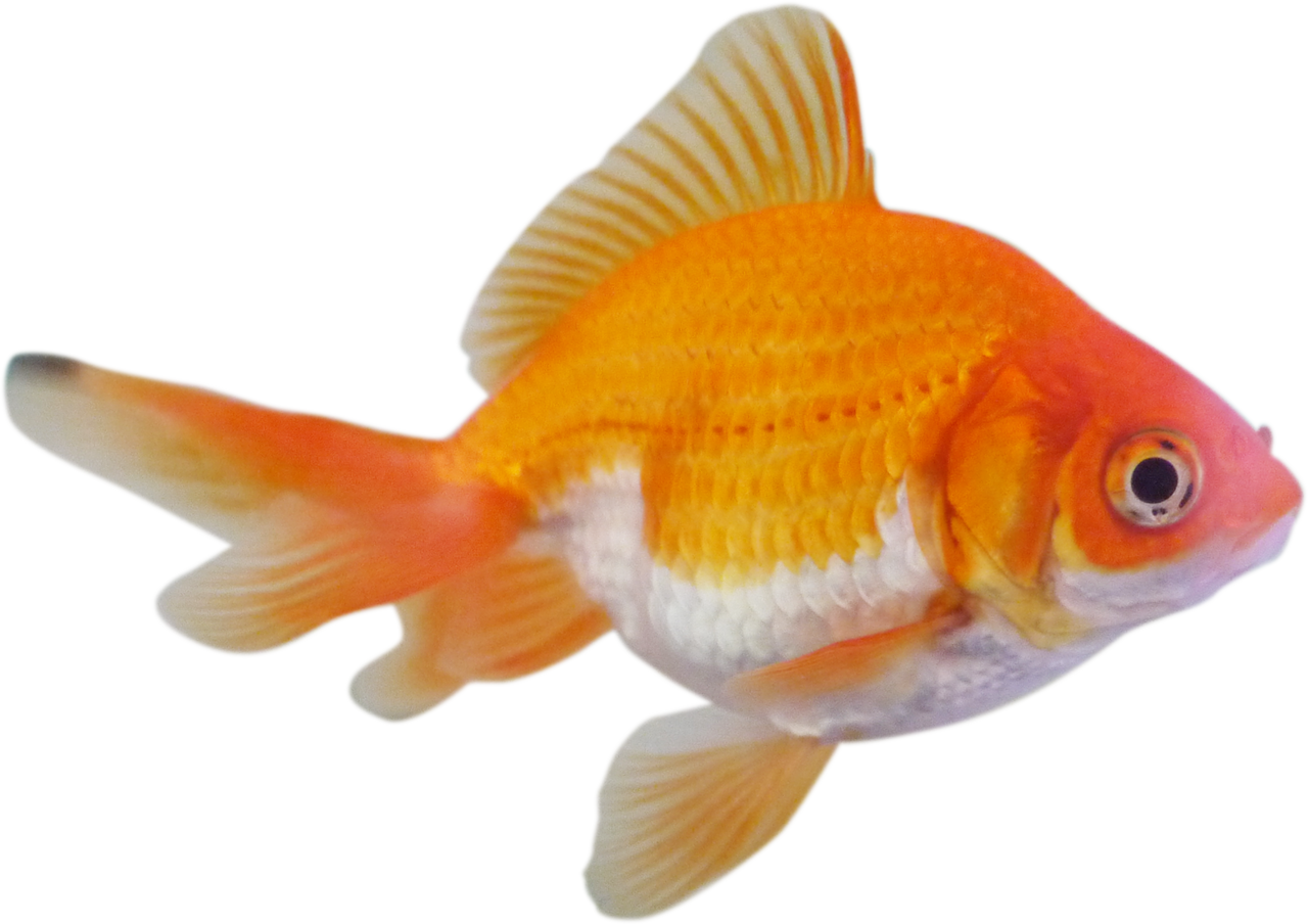
We are going to format the <div> element that displays the quote boxes to display with a goldfish in the lower left corner :) We are going to position and size the goldfish using some of the new background css properties described in the section above. NOTE: The goldfish should have been downloaded in Hands on 1
1. To apply rounded corners and a box shadow, make the following changes to the css in .quotebox:
a) Add the following code RIGHT BELOW the background-color property in the .quotebox css:
.quotebox {
overflow: auto;
background-color:peachpuff;
border-radius: 30px;
box-shadow: 2px 2px black;
background-clip:border-box;
color: black;
padding: 10px;
text-align: center;
margin: 10px;
z-index: 10;
}
b) Save your changes and view the page offline in the web browser.
2. To display the goldfish, add the following code: at the top of the .quotebox css as shown below:
.quotebox {
background:url('media/goldfish.png');
background-position:left bottom;
background-size:50px
50px;
background-origin:padding-box;
background-repeat:no-repeat;
overflow: auto;
background-color:peachpuff;
border-radius: 30px;
box-shadow: 2px 2px black;
background-clip:border-box;
color: black;
padding: 10px;
text-align: center;
margin: 10px;
z-index: 10;
}
3. Save your changes and view the page offline.
4. Correct any errors and keep the page open, you will be modifying it in the 3D animation exercise.
Task: Add animation to the famousQuote page that will make the quotes bounce and rock when the page is first loaded.
To see a video demonstration, watch: https://youtu.be/MR8tERm842o
1 Open famousQuote.html for editing
2. Add the code shown below to the bottom of the stylesheet:
@keyframes bounce {
0%{transform: translateY(0px);}
20% {transform: translateY(165px);}
30%
{transform:rotate(10deg);}
40%{transform:
translateY(0px);}
50% {transform:rotate(-10deg);}
60% {transform: translateY(100px);}
70%{transform:
translateY(0px);}
80%{transform:rotate(5deg);}
90%{transform: translateY(75px);}
}
div{
animation-name: bounce;
animation-iteration-count:1;
animation-duration: 1s;
}
To see an example of all the html and css for this page, view: famousQuote.pdf
3. Save your changes and test the file offline. Correct any errors.
Task: Use 3D transformation commands to create a cube
To see a video demonstration, watch: https://youtu.be/rjBY43s3qds (the video includes some background information on creating 3D transformations in addition to how to create the cube page)
1. Create a new html document. Name the file cube.html and save the file into the CIT180/Lesson9 folder.
2. Enter the code shown below (or print the following file, cube.pdf, and enter the code):
There are a couple of CSS styles you should take note of:
a) #the_cube is using transform-style:preserve3d. If you look in the html, you will see that the id is used in a div tag which is INSIDE another div tag (that is why preserve3d is being set).
b) Classes have been set up for each side of the cube. The only thing happening on each side is: 1) the side is rotated; and 2) the side is moved into position using translate.
3. When you are done, view the page offline in the web browser - your cube should look like the example shown below:
4. Once everything looks good, save your changes and close the file.
Task: Create a bouncing ball using CSS 3 animation
To see a video demonstration, watch: https://youtu.be/2lhEOOp_eTo (the video includes information on animation in addition to information on creating the bouncing ball page)
1. Create a new web page. Name the file bouncing-ball.html and save it into your Lesson9 folder
2. Add the code shown on the right side of the graphic below (you will be creating the bouncing ball displayed on the left side of the graphic)

3. Save your changes and view the page offline in a web browser.
4. You should see the ball bouncing up and down above the shadow.
5. Correct any problems and save your changes.
Task: Animate the title, the sections when the page first displays and the sections when the mouse hovers over them
To see a video demonstration, watch: https://youtu.be/OPjvH5r0Nqs
Part 1: Animating the title
1. Open css/song-snippet.css for editing.
2. To make the title animate and change color continuously while the page displays, we are going to create a class called pulse and then we are going to create animation keyframes to go with the new class.
Add the css below to song-snippet.css
.pulse{
    animation: pulse 5s infinite;
}

@keyframes pulse{
    0% {color:lemonchiffon;text-shadow:1px 1px black;}
    50% {color:#0c178f;text-shadow:10px 10px 2px lemonchiffon;}
    100%{color:darkgoldenrod;text-shadow:1px 1px darkgray;}
}
3. Open song-snippets.html for editing. To apply the pulse to the title, modify the <h1> tag by adding class="pulse" as shown below:
<header>
<h1 class="pulse">Simon and Garfunkle Song Snippets</h1>
</header>
4. Save your changes and view the page offline in a web browser. You should notice the title animating the entire time the page is displayed because the animation is set to infinite.
Part 2: Applying hover animation to each section
1. For the next effect, we want to change the background color of each section to aliceblue and make each section a little bigger when the mouse points at it. To do this, we need to apply a 2D scale transformation and color changes to section:hover.
Add the following CSS to song-snippets.css
section:hover{
    transform:scale(1.25,1.25);
    box-shadow: 5px 5px black;
    background-color:aliceblue;
    border-radius:50px;
    padding:30px;
}
2. Save your changes and view the page offline. Then point at each section and you should see it enlarge and the background color should change.
If you point to the bottom section with the background information, you will notice a little problem - when it enlarges, it is too big to display on the screen. To fix this, we are going to change the width for section and set the left and right margin to auto so the section will display centered.
Add the css shown below to the song-snippet.css file
section{
    width:75%;
    margin-left:auto;
    margin-right:auto;
}
3. Save your changes and reload the page. You should notice that the text in the background section is centered and when you point at it, the text isn't too large to display
Part 3: Making the sections animate when the page loads
1. For the last effect, we want the sections inside the article element to bounce and animate when the page displays. To do this, we need to create keyframes and give them a name. Then, we need to add the animation property to article>section with the keyframe animation name and the number of seconds we want the animation to play.
2. In the song-snippet.css file, add the following keyframe animation:
@keyframes moveIn{
    0%{transform: translateY(0px);}
    10% {transform: translateY(165px);}
    15% {transform:rotate(10deg);}
    20%{transform: translateY(0px);}
    25% {transform:rotate(-10deg);}
    30% {transform: translateY(100px);}
    35%{transform: translateY(0px);}
    40%{transform:rotate(5deg);}
    45%{transform: translateY(75px);}
    55%{transform:scale(1.5,1.5);}
    60%{transform: translateY(0px);}
    65% {transform: translateY(165px);}
    70% {transform:rotate(10deg);}
    75%{transform: translateY(0px);}
    80% {transform:rotate(-10deg);}
    85% {transform: translateY(100px);}
    90%{transform: translateY(0px);}
    95%{transform:rotate(5deg);}
    100%{transform: translateY(75px);}
}
3. Insert the the line shown below into the article>section css to connect the animation with the sections inside article
animation:moveIn 2s;
Here's how article>section should look when you are done:

4. Save your changes and reload song-snippets.html in the web browser. At this point, it should have all the necessary animation.
5. Correct any errors and save your changes.
1. FTP everything in the Lesson9 folder to the server. Make sure you drag the Lesson9 folder BELOW all existing folders. If you drag the folder on top of another one, you are placing it INSIDE that folder rather than in your directory.
You should have the following files in the folder:
famousQuote.html 9 points
cube.html 5 points
bouncing-ball.html 5 points
song-snippets.html 6 points
The Lesson9 folder should also contain the fonts folder with the caviardreams.ttf font inside, the css folder with song-snippets.css inside and the media folder with the zen-water.jpg and goldfish.png files inside.
2. After ftping, you should check the pages "live". If there are errors, you should correct them, then transfer the pages again and check them.