
Chapter 15 covers how to plot data and create charts in Python using Matplotlib and Plotly.
Examples from the chapter can be downloaded using the following link: Chapter_15.zip
For the assignment, you ONLY need to complete the hands-on exercises for your assignment (you don't need to complete all the small exercises within each chapter, although it is very good practice).
To see a lecture/demo on Matplotlib and Pyplot, view: https://youtu.be/x2TJF1thjc4
To see a lecture/demo on Plotly, view: https://youtu.be/tue9gpUBC6k
To see a lecture/demo on instructions for hands on 1 through 10, view: https://youtu.be/LbVmfjhV8_w
Matplotlib is a cross-platform library for making 2D plots from data in arrays. It has a procedural interface named Pylab, which is designed to resemble MATLAB ( a programming language used for mathematical and technical computing favored by engineers).
Matplotlib uses a numerical mathematic extension called NumPy which is designed to work with arrays.
Matplotlib is the open source equivalent of MATLAB.
We will be using Matplotlib.pyplot which contains a collection of functions that will let us plot data and create a wide variety of charts.
Matplotlib needs to be installed using the command prompt
python -m pip install --user matplotlib
Example:
To plot data, you will need to import Matplotlib.pyplot. It is standard practice to give pyplot an alias of plt when you import the module
Syntax:
import matplotlib.pyplot as plt
Once the module is imported, you can use it's functions
The plot() function is used to draw markers in a diagram. By default, the plot() function draws a line from point to point.
Syntax: plt.plot(xpoints,ypoints) or plt.plot(xpoints) or plt.plot(ypoints)
Where xpoints represent an array with x-axis points and ypoints represents an array with y-axis points
The show() function is used to display all figures
Syntax: plt.show()
With the plot and show functions, you can create a simple chart
Example plotting both x and y points:
When you run the program, you will probably see a message in the terminal window indicating Matplotlib is building the font cache and that it may take a moment. Eventually you should see a second window display with the chart
Sample Output
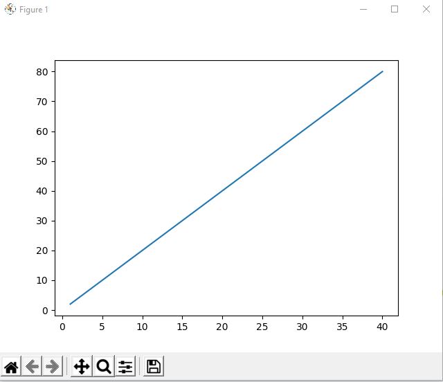
Code Example only plotting xpoints:
You can add a chart title, x-axis title and y-axis title
Syntax:
plt.title("chart title", optional parameters)
plt.xlabel("axis title", optional parameters)
plt.ylabel("axis title", optional parameters)
Optional parameters include:
Example:
Example:
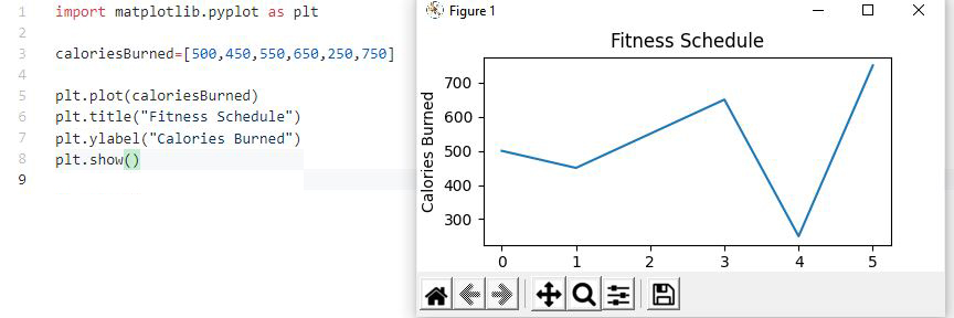
The grid() function can be used to add gridlines to the chart.
Syntax: plt.grid()
Example:
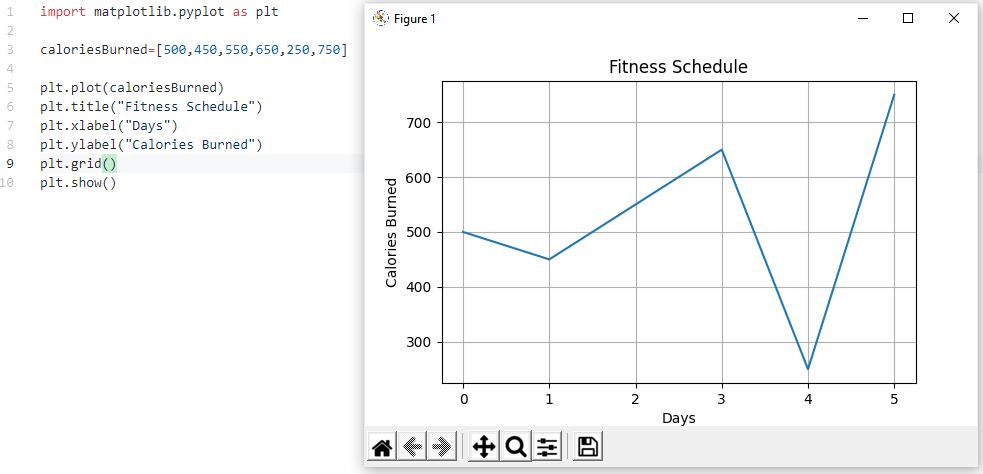
1. Open the command prompt on your system and install Matplotlib (see full example above)
python -m pip install --user matplotlib
2. Create a Chapter15 folder inside your CIT228 folder
3. Create a new file named cubes.py
4. Create a program that cubes the numbers 1 through 5 and charts the values. Your code should be similar to the example below, but you are cubing the numbers instead of squaring the numbers
5. Run the program to produce the following chart:

The subplots() function let you draw multiple plots in a single figure and they give you control over the layout.
Syntax: plt.subplot(#rows,#cols,currentPlot#)
The values for rows, columns and currentPlot depend on how many graphs you are going to create and how you are going to organize them.
Example showing 2 graphs laid out in a single row:
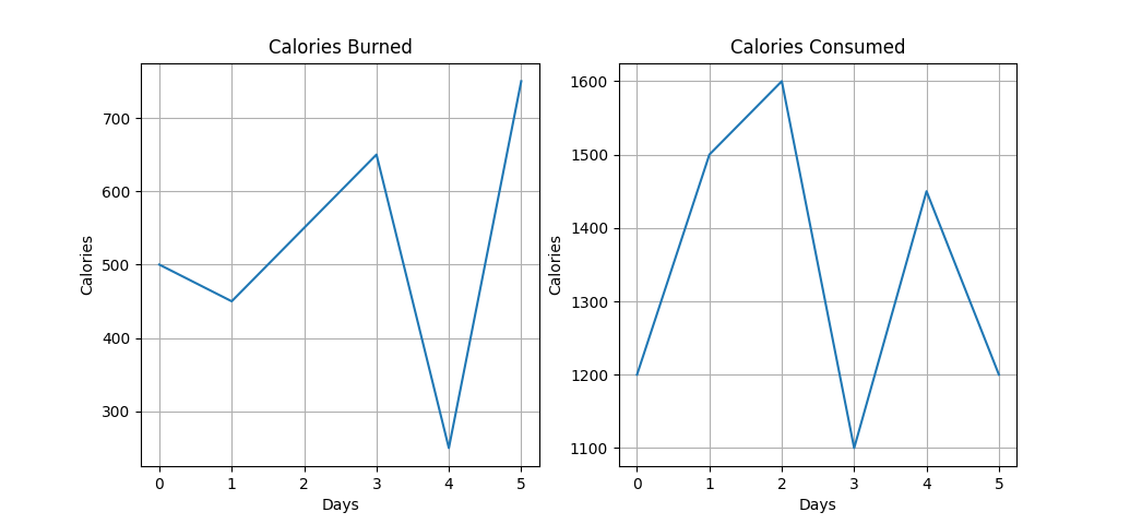
If you are using subplots() and you have multiple charts, you can add a title for the figure using the suptitle() function
The function uses the same optional parameters as the title and axis titles (fontfamily, fontsize, color)
Example:
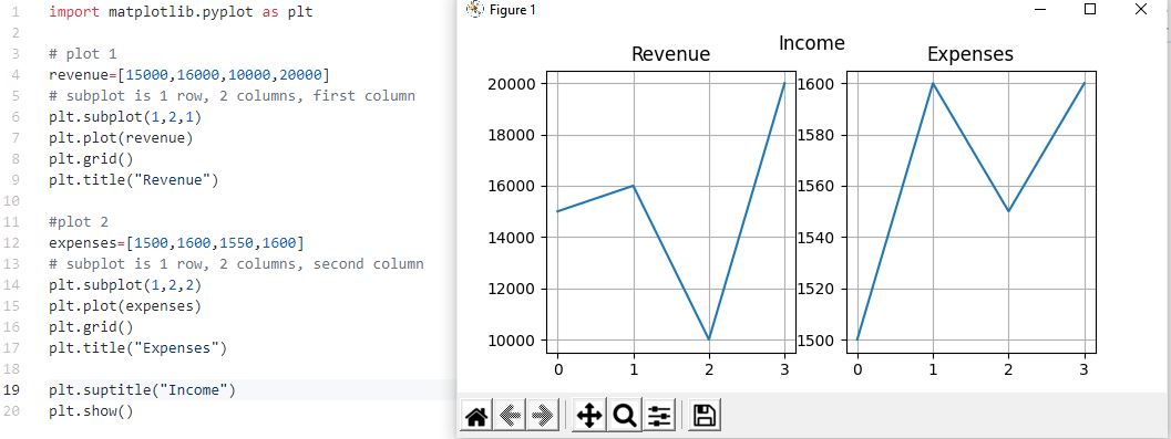
There are several functions and methods that allow customization of the x and y axis and the tick marks on the axes.
Arguments are used to change the appearance of tics and labels on the x and/or y axis
Syntax: plt.tick_params(arguments)
Where some of the arguments could be:
Sets limits for the x and y axis
Syntax: plt.axis([minX,maxX,minY,maxY])
Example using tick_params and axis()
Sample Output

When you run your program and display the plot, you can manually save it by selecting the save icon in the plot window.
Pyplot includes an automatic way to save your plots that is easy to use.
Syntax: plt.savefig('filename.png', arguments)
Popular arguments include:
By default, the graphic will be saved to the same directory as your program using whatever filename you specify.
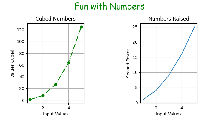
1. Modify cubes.py to create 2 charts with a title for the figure as shown below
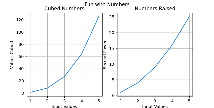
2. You will need to add code for a second chart that raises numbers to the second power.
3. You need to modify your current code to match the example below:
NOTE: We need to use plt.subplot because we are creating more than 1 plot within a single figure.
3. Above the plt.show() command, and below the revised code for the cubed chart, add code to create the Numbers Raised chart.
a) Duplicate the code for the cubed chart and change the cubed variable to pow
b) In the for loop, use list2.append(num**2) for the equation (NOTE: list2 is whatever you are calling the list that will store the values raised to the second power)
c) For the subplot code, use ax2 = plt.subplot(1,2,2) - this represents, 1 row, 2 columns, second column chart
d) To plot the chart, use ax2.plot(inputVal,list2)
e) Add the titles as shown in the example
4. The last line of the code should be plt.show() This command is only called 1 time. To add a title to the figure, right above that line, code plt.suptitle("Fun with Numbers")
5. Run the program.
There are several plot() function arguments you can use that let you customize how the markers and lines look.
You can customize the markers by adding the marker argument to the plot() function
Syntax: plt.plot(xpoints,ypoints,marker='type')
Where marker type can be:
| Marker | Description | |
|---|---|---|
| 'o' | Circle | |
| '*' | Star | |
| '.' | Point | |
| ',' | Pixel | |
| 'x' | X | |
| 'X' | X (filled) | |
| '+' | Plus | |
| 'P' | Plus (filled) | |
| 's' | Square | |
| 'D' | Diamond | |
| 'd' | Diamond (thin) | |
| 'p' | Pentagon | |
| 'H' | Hexagon | |
| 'h' | Hexagon | |
| 'v' | Triangle Down | |
| '^' | Triangle Up | |
| '<' | Triangle Left | |
| '>' | Triangle Right | |
| '1' | Tri Down | |
| '2' | Tri Up | |
| '3' | Tri Left | |
| '4' | Tri Right | |
| '|' | Vline | |
| '_' | Hline | |
Example:
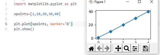
You can customize the line style by adding the ls argument to the plot() function
Syntax: plt.plot(xpoints,ypoints,ls='type')
Where line style type can be:
| Style | Or | |
|---|---|---|
| 'solid' (default) | '-' | |
| 'dotted' | ':' | |
| 'dashed' | '--' | |
| 'dashdot' | '-.' | |
| 'None' | '' or ' ' | |
Example:
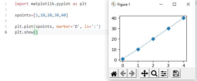
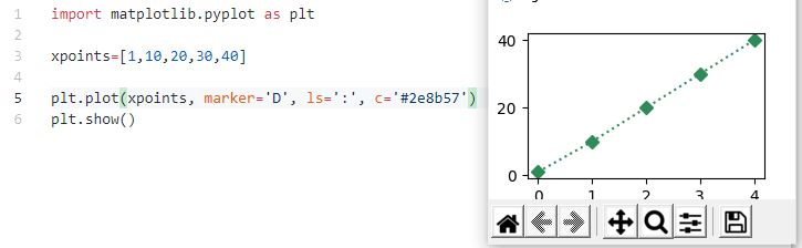
You can customize the line color by adding the color argument to the plot() function.
Syntax: plt.plot(xpoints,ypoints,c='type')
Where color type can be hexidecimal color values or color names
Color Name Example:
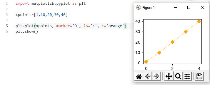
Hexidecimal Color Example:
You can customize the thickness of the line using the linewidth argument.
Syntax: plt.plot(xpoints,ypoints,lw='size')
Where size is a floating point value enclosed in quotes
Example:
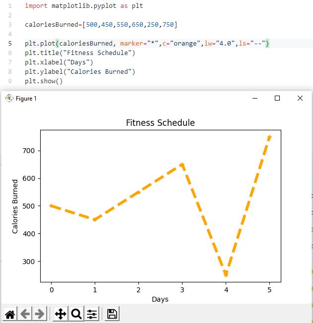
1. Modify cubes.py by customizing the markers and lines in one of the charts. Add a marker, color, linewidth and linestyle to the chart.
2. Modify the figure title by adding a fontsize, fontfamily and color
Example:

NOTE: To make more space between the title and plots, you can use subplots_adjust(top="top of chart", bottom="bottom of chart", hspace="vertical space between charts", wspace="horizontal space between plots")
In the example above, to put more space between the title and charts AND to put space between each chart, I could add the following code
Sample Output after the change:
Matplotlib has several builtin styles you can apply to your charts. To see what you have available, open the command prompt and enter the following:
C:\Users\Lisa.LAPTOP>python
Python 3.9.1 (tags/v3.9.1:1e5d33e, Dec 7 2020, 17:08:21) [MSC v.1927 64 bit (AMD64)] on win32
Type "help", "copyright", "credits" or "license" for more information.
>>> import matplotlib.pyplot as plt
>>> plt.style.available
['Solarize_Light2', '_classic_test_patch', 'bmh', 'classic', 'dark_background', 'fast', 'fivethirtyeight', 'ggplot', 'grayscale', 'seaborn', 'seaborn-bright', 'seaborn-colorblind', 'seaborn-dark', 'seaborn-dark-palette', 'seaborn-darkgrid', 'seaborn-deep', 'seaborn-muted', 'seaborn-notebook', 'seaborn-paper', 'seaborn-pastel', 'seaborn-poster', 'seaborn-talk', 'seaborn-ticks', 'seaborn-white', 'seaborn-whitegrid', 'tableau-colorblind10']
>>>
To apply one of the styles listed, use the following syntax:
plt.style.use("styleName")
plt.plot(input,output)
All the arguments for styling the plots can be used with the builtin styles
Example:
Example shows 6 plots with different styles applied:

1. Modify cubes.py by applying a builtin style to the chart you haven't modified (if you modified both with arguments, that is OK, you can still apply one of the builtin styles)
2. After applying the builtin style, feel free to modify the color, linewidth, line style and marker to whatever you want.
Example:

Code modified for the example is shown below:
You can create 2D and 3D charts using Matplotlib.
2D charts include:
3D charts include:
We will cover several of the different chart types. If you are interested in seeing information on all the charts and the 3D charts, see: https://www.tutorialspoint.com/Matplotlib/index.htm
Scatter plots are used to plot data points on horizontal and vertical axis in the attempt to show how much one variable is affected by another. There is typically some type of range you are plotting against to observe trends ore relatonships in the data. The dots in a scatter plot report individual data points AND patterns when the data are taken as a whole.
Syntax:
plt.scatter(list#1, numericRange,arguments)
plt.scatter(list#2,numericRange,arguments)
plt.scatter(list#n, numericRange,arguments)
Where arguments can be color, markers, linewidth, label size, etc.
Example: In the example below, pre-test scores are plotted against a set range for the scores. Post-test scores are also plotted against the same set range for scores so a comparison between the two exams can be made and conclusions about the data can be drawn.
Sample Chart:
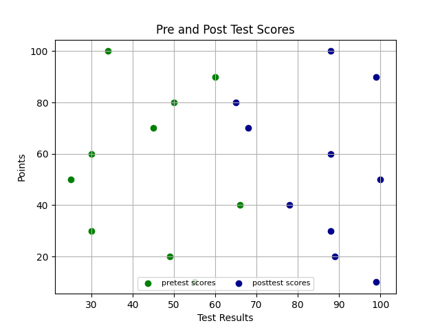
A few things to note about the code:
1. Instead of using plt.plot, we used plt.scatter
2. Since there is more than 1 series of data in the chart, a legend was added
Anytime you have more than 1 series of data, you should display a legend. There are several different techniques you can use.
The easiest way to display a legend is to:
a) add label="legend text" to the arguments passed to scatter (or plot )
b) include plt.legend(loc="location for legend", ncol=columnsDisplayedInLegened, fontsize=#)
Location for legend can be:
Example:
plt.legend(loc='lower center, ncol=2, fontsize=8)
NOTE: If you do not include labels in plt.scatter or plt.plot, then you need to include more information in the plt.legend arguments.
For more information on using the legend, see: https://Matplotlib.org/3.1.1/api/legend_api.html
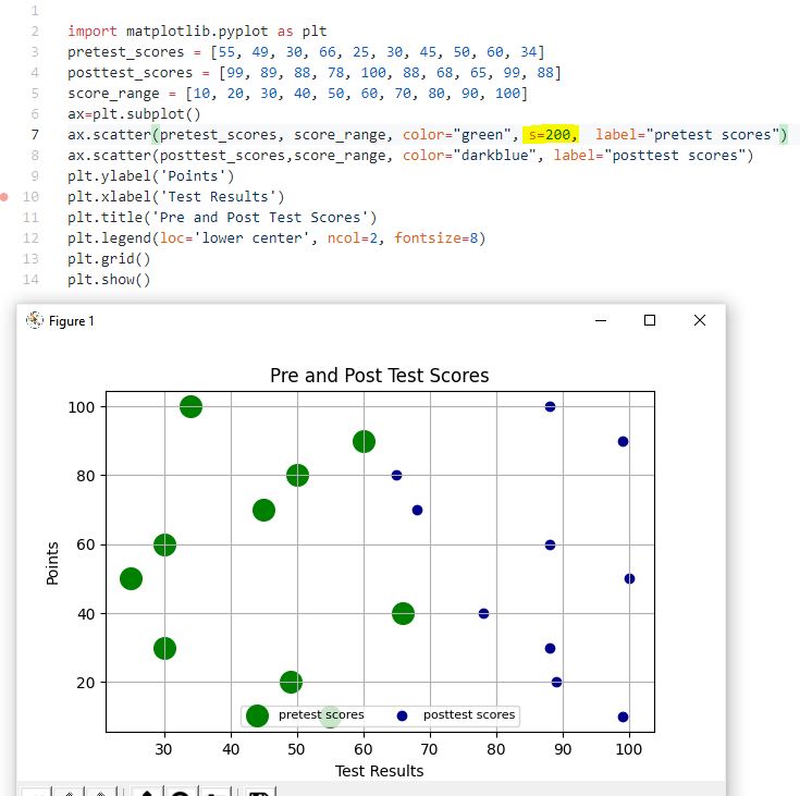
The size argument is used in scatter plots to increase the size of the dots
Syntax: plt.scatter(values,range,s=#)
Example: In the example below, the green dots have a size of 200 and the dark blue have a "normal" size.
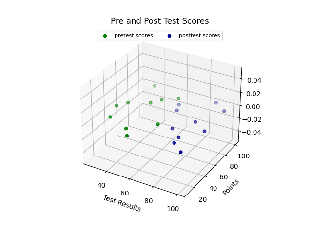
To make the scatter plot 3D, you need to provide a set of Z values and you need to use plt.subplot to indicate you want a 3D projection. The Z values will need to be included in the arguments you send to the scatter function
Syntax:
ax = plt.subplot(project='3d')
ax.scatter(list#1,range,zvalue,arguments)
ax.scatter(list#2, range,z-value, arguments)
ax.scatter(list#n, range,z-value, arguments)
Example: In the example below, Z-values are set to 0. The variable ax contains plt.subplot with the 3D projection setting. The ax variable was used to create both scatter plots and the Z values of zero were added after the scores. The legend was adjusted to use the "upper center" location.
Sample Output:
1. Download scatter.py into your Chapter15 folder
2. Temperature data has been provided for 4 months along with the day the temps were recorded on.
3. You need to create scatter plots for each month. You should include
a) a color and label identifying what each plot represents
b) xlabel
c) ylabel
d) legend
e) title
Example of a completed scatter plot:

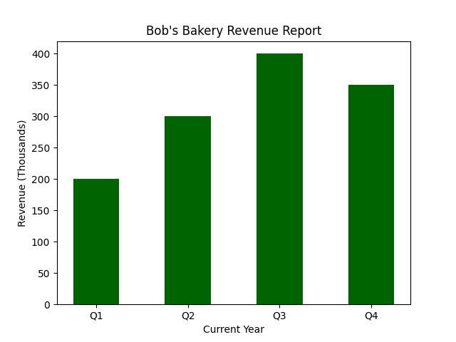
Bar plots (or charts) are typically used to make comparisons. You can plot 1 series of data points (or bars) or multiple series. In Matplotlib, plotting multiple series is a bit more complicated, so we will start with a single series first
Syntax for a vertical chart: plt.bar(x_labels,data,arguments)
Where arguments are typically color and width of the bar.
Example:
Sample Output:
Syntax for a horizontal chart: plt.barh(x_labels,data,arguments)
Example:
Sample Output:

When plotting multiple series, a stacked bar chart is pretty straightforward and only requires adding another plt.bar() statement for the second series.
Vertical Syntax:
plt.bar(x_labels,dataSet1,arguments)
plt.bar(x_labels,dataSet2,arguments)
Example
NOTE: labels were added to each plt.bar command so they could display in the legend. The legend was added using plt.legend(loc="best")
Sample Output

Horizontal Syntax:
plt.barh(x_labels,dataSet1,arguments)
plt.barh(x_labels,dataSet2,arguments)
Example:
NOTE: labels were added to each plt.bar command so they could display in the legend. The legend was added using plt.legend(loc="best")
Sample Output:
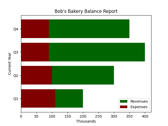
For a clustered bar chart, you need to provide positioning for each bar on the x axis.
This is done by calculating the space between the bars and adding in the width of the bars.
The arrange function is part of the NumPy module. NumPy is used to make array processing in Python more efficient. You will see it included in many Matplotlib applications because the data is stored in arrays. to use arrange(), we need to import NumPy
Syntax to import NumPy:
import numpy as np
NOTE: It is standard practice to give NumPy an alias of np
Syntax to use arrange:
barPos1 = np.arrange(len(dataSeries1))
To position additional bars, you use the position of the previous set of bars
barPos2 = [x + barWidth for x in barPos1]
barPos3 = [x + barWidth for x in barPos2]
To position the category-x labels, you need to use plt.xticks()
Syntax: plt.xticks([r + barWidth for r in range(len(dataSeries1))],xSeriesVariable)
Example showing how to position bars on the x axis and display the category x labels in a clustered bar chart:
Sample Output:

1. Download bar_charts.py and save the file into your Chapter15 folder.
2. The lists for men, women, total and range have been filled in for you. The values represent fast food consumption per day broken down by age and sex.
3. You need to add the following to create the chart:
a) bar width
b) position of each bar on the x axis
c) xticks
d) plt.bar statements (include a color, the bar width and a label for the legend)
e) ylabel
f) xlabel
g) title
h) legend
Example of a completed chart:

Pie charts are used to plot 1 series of data to show how each wedge contributes to the whole.
You need to provide the labels, values and which series you want exploded (separated) from the pie.
Syntax:
plt.pie(values,explode=List,labels=List, autopct=format, shadow=True or False, startangle=#)
values are what you are planning on charting (the values should be in a list
explode should have a list with a 0 or decimal for each pie wedge. 0 means do NOT explode. a decimal means explode (or separate) from the pie
labels should have a list of labels for each wedge that correspond to the values provided
autopct can displays the percentage of the whole each wedge occupies. The format is: '%#.#f%%' Where the first # is the whole number and .# is the number of decimal places you want displayed int he value. NOTE: By default, the values you chart are automatically converted to percentages and the wedges represent the percentages
shadow set to True will put a shadow at the bottom of the pie
startangle=# will rotate the pie to the position indicated by the startangle
Example:
Sample Output:
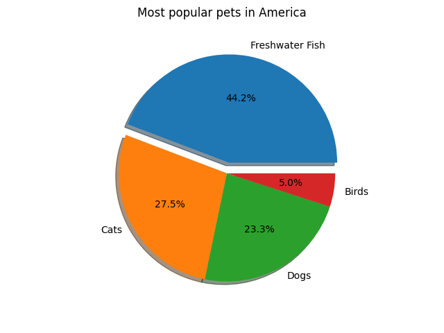
Showing the values instead of the percentages in a pie chart, is not an easy task. It requires creating a function to convert the percentages back into whole numbers (you will lose the decimal portion of the original number, even if you format the value as a float, the original decimal portion was lost when it converted to a percentage for the pie wedges)
The function is calling the format() function which is used to format numbers. The format() function returns a formatted string based on the formatting type provided.
Syntax:
variable = "{:type}".format(valueToFormat)
Some of the more useful formatting types include:
"{:,}" - inserts commas as a thousands operator
"{:%}" - percentage format
"{:.2f}" - float format with 2 decimal places
"{:,.2f}" - float format with commas and 2 decimal places
For more information, see: https://www.geeksforgeeks.org/python-format-function/
Programming Example:
Sample Output:

To apply different colors for the wedges of the pie, you need to create a tuple with the colors specified and then set the color argument to your tuple variable
Example:
Sample Output
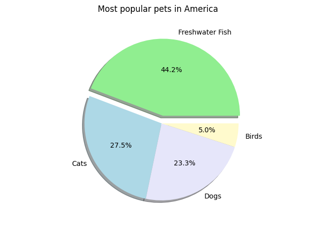
1. Create a pie chart using the data shown in the table below:
| Image Format | # used at sites |
| PNG | 376 |
| JPEG | 348 |
| SVG | 153 |
| GIF | 104 |
| Other | 19 |
2. Make sure each wedge of the pie displays a percentage with 1 decimal place.
3. The pie should have a shadow applied to it and the data labels (text) should display next to each wedge.
4. Explode one of the wedges in the pie and rotate the pie to a starting angle that you like.
5. Give the chart a title (you decide on the title).
6. Add custom colors to each wedge of the pie
Example of what your pie could look like (your start angle, exploded wedge, title, colors etc may look different because you can pick your own settings!)

Histograms provide a visual interpretation of numerical data by indicating the number of data points that lie within a range of values. These ranges of values are called classes or bins. The frequency of the data that falls in each class is depicted by the use of a bar. Each bar in a histogram reprsents a range of data points.
For histograms, you should try to have between 5 to 20 data intervals (or bins). This requires grouping some data together. If you look at the data, you should see natural groupings. You just need to tell pyplot how many groupings (or bins) you need to use.
Syntax to create a histogram: plt.hist (value, bins=#, arguments)
Where value represents the list of values you want plotted
bins is the number of groupings you want the values placed into
arguments typically involve selecting the color of the bars.
In the example below, I am rolling the dice 500 times and storing each value in a list. Since the values on the dice can be 1 through 6, that provides a natural way to group data for the bins.
Sample Output:

Example #2 Distribution of weight values collected over 30 days. When analyzed, the values logically fit into 9 different groupings (or bins).
Sample Output

1. Download histogram.py to your CIT228/Chapter15 folder
2. Determine how many bins you need based on the data in the list (HINT: To figure out the bins, I would print out the sorted fitness_test)
3. Create a histogram to visually display the data.
4. Give the plot a title and label the x and y axis (you decide the text for the titles)
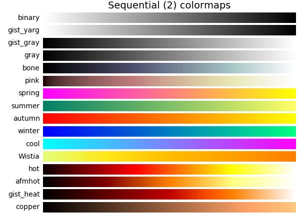
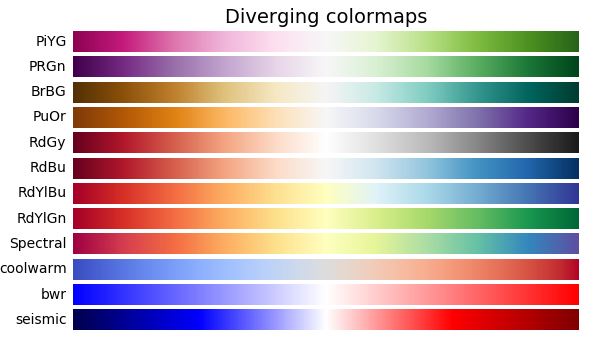
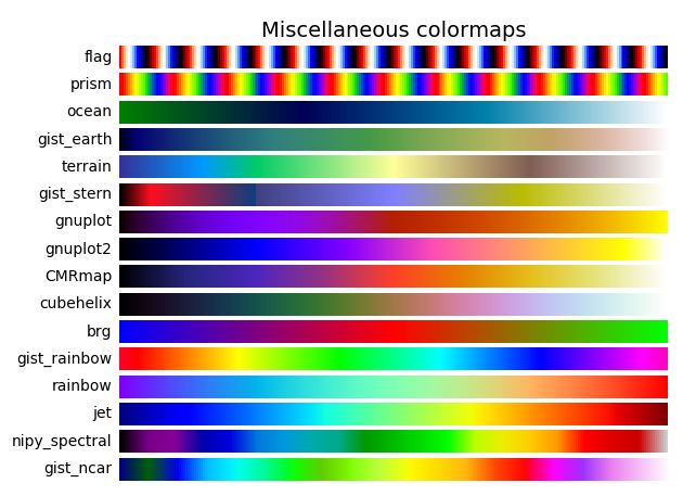
Matplotlib includes color gradients called colormaps that let you emphasize a pattern within the data using color. The list below includes some of the color names available for use:
Perceptually Uniform Sequential = ['viridis', 'plasma', 'inferno', 'magma']

Sequential =
['Greys', 'Purples', 'Blues', 'Greens', 'Oranges', 'Reds', 'YlOrBr', 'YlOrRd', 'OrRd', 'PuRd', 'RdPu', 'BuPu', 'GnBu', 'PuBu', 'YlGnBu', 'PuBuGn', 'BuGn', 'YlGn']
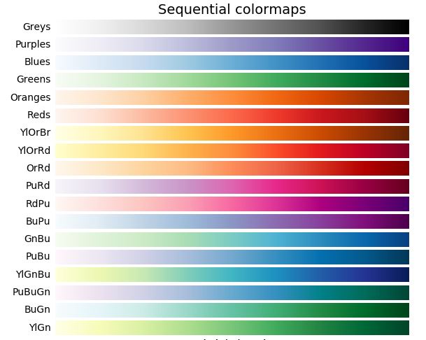
Sequential (2)= ['binary', 'gist_yarg', 'gist_gray', 'gray', 'bone', 'pink', 'spring', 'summer', 'autumn', 'winter', 'cool', 'Wistia', 'hot', 'afmhot', 'gist_heat', 'copper']
Diverging=
['PiYG', 'PRGn', 'BrBG', 'PuOr', 'RdGy', 'RdBu', 'RdYlBu', 'RdYlGn', 'Spectral', 'coolwarm', 'bwr', 'seismic']
Qualitative= ['Pastel1', 'Pastel2', 'Paired', 'Accent', 'Dark2', 'Set1', 'Set2', 'Set3', 'tab10', 'tab20', 'tab20b', 'tab20c']

Miscellaneous= ['flag', 'prism', 'ocean', 'gist_earth', 'terrain', 'gist_stern', 'gnuplot', 'gnuplot2', 'CMRmap', 'cubehelix', 'brg', 'hsv', 'gist_rainbow', 'rainbow', 'jet', 'nipy_spectral', 'gist_ncar']
Colormaps work best with scatter plots because they are designed to help visualize patterns. You can apply then to other plots, but not all the colormaps are available and they don't always display the way you think they will.
To use a colormap with a scatter plot, you need to connect it to each y value of data in your data set and you need to specify which colormap you are going to use.
This can be done in the scatter function
Syntax: plt.scatter(xValues,yValues,c=yValues, cmap=plt.cm.Name)
c=yValues connects each y value to the colormap and cmap=plt.cm.Name specifies which colormap you want to use
Example:

1. Open scatter.py and add a colormap to the plot.
2. Comment out the legend (it won't display the colors properly)
3. Add a Title and Subtitle using plt.suptitle for the title and plt.title for the subtitle
Example (you can use any of the colormaps you want, in the example, the summer temps are using the YlOrRd colormap and the winter temps are using the GnBu colormap

Plotly lets you share and manipulate your plots online.
Plotly is free and open source. It contains everything you needd to write figures to standalone HTML files
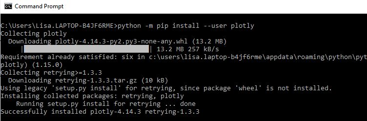
Installation is done through the command prompt using pip
python -m pip install --user plotly
Plotly version 4 is for offline use only. Once you create the web page, you can transfer it to your site using ftp.
After you create a chart using Plotly, it will open and display in your web browser.
We will cover how to create several types of charts, but there are over 30 chart types available that you can see at: https://plotly.com/python/basic-charts/
There are many flavors of Plotly. Plotly express has a lot of documentation, but requires downloading and installing pandas (which we aren't going to do).
To create figures using Plotly, you need to use a dictionary object or a graph object. We will be using a graph object because there are more features and ways to customize the graphic.
Syntax: import plotly.graph_objects as go
The syntax varies depending upon what type of chart you are creating. In general, these are the steps you need to follow:
Pie Chart Example:
fig = go.Figure(data=[go.Pie(labels=labels, values=numPets)])
Pie Chart Example:
fig.update_traces is used to customize the interactivity in the pie chart.
Key points for the settings used above:
Pie Chart Example:
There are many settings you can use in update_layout. To find additional arguments, see: https://plotly.com/python/reference/layout/
Key points for the settings used above:
For more information on using plotly.graph_objects, see: https://plotly.com/python-api-reference/generated/plotly.graph_objects.Figure.html
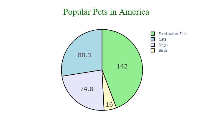
Example that creates a pie chart:
Sample Output
Example that creates a two column bar chart:
To view the chart live, see: bar.html
Example that creates a styled line plot
To see the example live, view: line.html
To save the plot as a webpage, you need to do 3 things:
1) import plotly offline
2) store fig.update_layout in a variable
3) Comment out fig.show() and add a line similar to the one below:
When you run the code, you will still see it display in the browser. BUT it will also create the specified html file in the directory you are running Python out of
Programming example:
NOTE: I am running Python out of my CIT228 directory so that is where it saved bar.html to.
1. Create a new file named plotly chart.py
2. Copy the code from the cubes, bars or scatter assignment files into plotly and modify it to display offline in the web browser. Make sure you save the file created as plotly.html
1. You should have the following files in your Chapter15 folder:
| Exercise | Assignment Files | Points |
|---|---|---|
| Hands On 1,2,3 and 4 | cubes.py | 10 points |
| Hands On 5 and 9 | scatter.py | 10 points |
| Hands On 6 | bars.py | 10 points |
| Hands On 7 | pie.py | 10 points |
| Hands On 8 | histogram.py | 10 points |
| Hands On 10 | plotly chart.py | 10 points |
2. Upload Chapter 15 to GitHub.
a. Click the ... next to CIT228 Git and select the Changes menu, Stage all Changes command.
b. In the Message window below Source Control, enter Chapter15 and then click the ... next to CIT228 Git and select the Commit menu, Commit Staged command
c. Display the menu next to the CIT228 Git folder by selecting ... and select the Push command
d. This will put all files and folders inside your CIT228/Chapter15 directory into your GitHub repository
3. Open a web browser and go to your CIT228 repository. Make sure the Chapter15 directory and files are there, then copy the URL and paste it into the lab assignment dropbox (you are done with the first part of your lab assignment!)